
Software product metrics measure quality, performance, and user satisfaction, aligning with business goals to improve your software. This article explains essential metrics and their role in guiding development decisions.
Software product metrics are quantifiable measurements that assess various characteristics and performance aspects of software products. These metrics are designed to align with business goals, add user value, and ensure the proper functioning of the product. Tracking these critical metrics ensures your software meets quality standards, performs reliably, and fulfills user expectations. User Satisfaction metrics include Net Promoter Score (NPS), Customer Satisfaction Score (CSAT), and Customer Effort Score (CES), which provide valuable insights into user experiences and satisfaction levels. User Engagement metrics include Active Users, Session Duration, and Feature Usage, which help teams understand how users interact with the product. Additionally, understanding software metric product metrics in software is essential for continuous improvement.
Evaluating quality, performance, and effectiveness, software metrics guide development decisions and align with user needs. They provide insights that influence development strategies, leading to enhanced product quality and improved developer experience and productivity. These metrics help teams identify areas for improvement, assess project progress, and make informed decisions to enhance product quality.
Quality software metrics reduce maintenance efforts, enabling teams to focus on developing new features and enhancing user satisfaction. Comprehensive insights into software health help teams detect issues early and guide improvements, ultimately leading to better software. These metrics serve as a compass, guiding your development team towards creating a robust and user-friendly product.
Software quality metrics are essential quantitative indicators that evaluate the quality, performance, maintainability, and complexity of software products. These quantifiable measures enable teams to monitor progress, identify challenges, and adjust strategies in the software development process. Additionally, metrics in software engineering play a crucial role in enhancing overall software product’s quality.
By measuring various aspects such as functionality, reliability, and usability, quality metrics ensure that software systems meet user expectations and performance standards. The following subsections delve into specific key metrics that play a pivotal role in maintaining high code quality and software reliability.
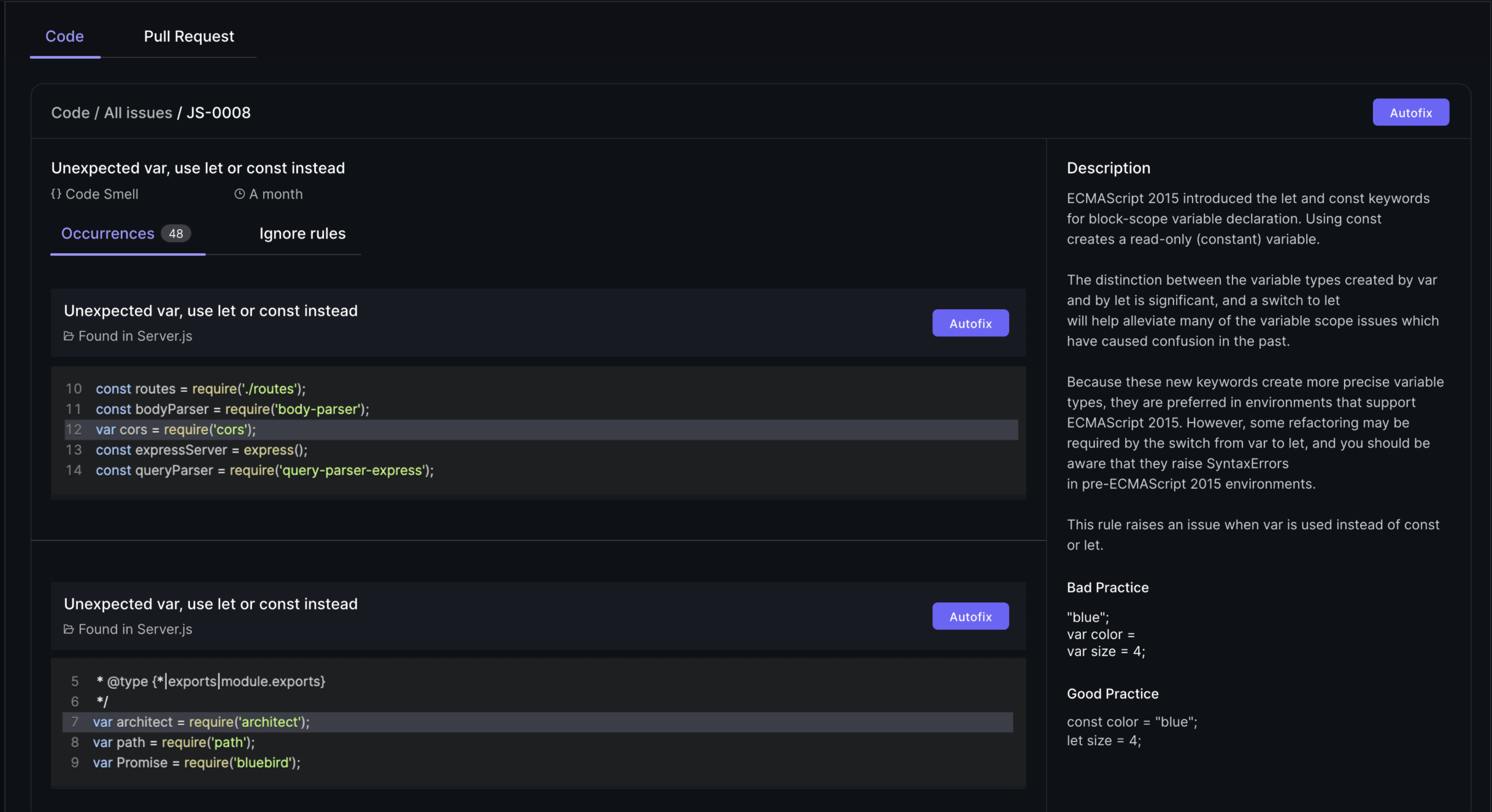
Defect density is a crucial metric that helps identify problematic areas in the codebase by measuring the number of defects per a specified amount of code. Typically measured in terms of Lines of Code (LOC), a high defect density indicates potential maintenance challenges and higher defect risks. Pinpointing areas with high defect density allows development teams to focus on improving those sections, leading to a more stable and reliable software product and enhancing defect removal efficiency.
Understanding and reducing defect density is essential for maintaining high code quality. It provides a clear picture of the software’s health and helps teams prioritize bug fixes and software defects. Consistent monitoring allows teams to proactively address issues, enhancing the overall quality and user satisfaction of the software product.
Code coverage is a metric that assesses the percentage of code executed during testing, ensuring adequate test coverage and identifying untested parts. Static analysis tools like SonarQube, ESLint, and Checkstyle play a crucial role in maintaining high code quality by enforcing consistent coding practices and detecting potential vulnerabilities before runtime. These tools are integral to the software development process, helping teams adhere to code quality standards and reduce the likelihood of defects.
Maintaining high code quality through comprehensive code coverage leads to fewer defects and improved code maintainability. Software quality management platforms that facilitate code coverage analysis include:
The Maintainability Index is a metric that provides insights into the software’s complexity, readability, and documentation, all of which influence how easily a software system can be modified or updated. Metrics such as cyclomatic complexity, which measures the number of linearly independent paths in code, are crucial for understanding the complexity of the software. High complexity typically suggests there may be maintenance challenges ahead. It also indicates a greater risk of defects.
Other metrics like the Length of Identifiers, which measures the average length of distinct identifiers in a program, and the Depth of Conditional Nesting, which measures the depth of nesting of if statements, also contribute to the Maintainability Index. These metrics help identify areas that may require refactoring or documentation improvements, ultimately enhancing the maintainability and longevity of the software product.
Performance and reliability metrics are vital for understanding the software’s ability to perform under various conditions over time. These metrics provide insights into the software’s stability, helping teams gauge how well the software maintains its operational functions without interruption. By implementing rigorous software testing and code review practices, teams can proactively identify and fix defects, thereby improving the software’s performance and reliability.
The following subsections explore specific essential metrics that are critical for assessing performance and reliability, including key performance indicators and test metrics.
Mean Time Between Failures (MTBF) is a key metric used to assess the reliability and stability of a system. It calculates the average time between failures, providing a clear indication of how often the system can be expected to fail. A higher MTBF indicates a more reliable system, as it means that failures occur less frequently.
Tracking MTBF helps teams understand the robustness of their software and identify potential areas for improvement. Analyzing this metric helps development teams implement strategies to enhance system reliability, ensuring consistent performance and meeting user expectations.
Mean Time to Repair (MTTR) reflects the average duration needed to resolve issues after system failures occur. This metric encompasses the total duration from system failure to restoration, including repair and testing times. A lower MTTR indicates that the system can be restored quickly, minimizing downtime and its impact on users. Additionally, Mean Time to Recovery (MTTR) is a critical metric for understanding how efficiently services can be restored after a failure, ensuring minimal disruption to users.
Understanding MTTR is crucial for evaluating the effectiveness of maintenance processes. It provides insights into how efficiently a development team can address and resolve issues, ultimately contributing to the overall reliability and user satisfaction of the software product.
Response time measures the duration taken by a system to react to user commands, which is crucial for user experience. A shorter response time indicates a more responsive system, enhancing user satisfaction and engagement. Measuring response time helps teams identify performance bottlenecks that may negatively affect user experience.
Ensuring a quick response time is essential for maintaining high user satisfaction and retention rates. Performance monitoring tools can provide detailed insights into response times, helping teams optimize their software to deliver a seamless and efficient user experience.
User engagement and satisfaction metrics are vital for assessing how users interact with a product and can significantly influence its success. These metrics provide critical insights into user behavior, preferences, and satisfaction levels, helping teams refine product features to enhance user engagement.
Tracking these metrics helps development teams identify areas for improvement and ensures the software meets user expectations. The following subsections explore specific metrics that are crucial for understanding user engagement and satisfaction.
Net Promoter Score (NPS) is a widely used gauge of customer loyalty, reflecting how likely customers are to recommend a product to others. It is calculated by subtracting the percentage of detractors from the percentage of promoters, providing a clear metric for customer loyalty. A higher NPS indicates that customers are more satisfied and likely to promote the product.
Tracking NPS helps teams understand customer satisfaction levels and identify areas for improvement. Focusing on increasing NPS helps development teams enhance user satisfaction and retention, leading to a more successful product.
The number of active users reflects the software’s ability to retain user interest and engagement over time. Tracking daily, weekly, and monthly active users helps gauge the ongoing interest and engagement levels with the software. A higher number of active users indicates that the software is effectively meeting user needs and expectations.
Understanding and tracking active users is crucial for improving user retention strategies. Analyzing user engagement data helps teams enhance software features and ensure the product continues to deliver value.
Tracking how frequently specific features are utilized can inform development priorities based on user needs and feedback. Analyzing feature usage reveals which features are most valued and frequently utilized by users, guiding targeted enhancements and prioritization of development resources.
Monitoring specific feature usage helps development teams gain insights into user preferences and behavior. This information helps identify areas for improvement and ensures that the software evolves in line with user expectations and demands.
Financial metrics are essential for understanding the economic impact of software products and guiding business decisions effectively. These metrics help organizations evaluate the economic benefits and viability of their software products. Tracking financial metrics helps development teams make informed decisions that contribute to the financial health and sustainability of the software product. Tracking metrics such as MRR helps Agile teams understand their product's financial health and growth trajectory.
The following subsections explore specific financial metrics that are crucial for evaluating software development.
Customer Acquisition Cost (CAC) represents the total cost of acquiring a new customer, including marketing expenses and sales team salaries. It is calculated by dividing total sales and marketing costs by the number of new customers acquired. A high customer acquisition costs (CAC) shows that targeted marketing strategies are necessary. It also suggests that enhancements to the product’s value proposition may be needed.
Understanding CAC is crucial for optimizing marketing efforts and ensuring that the cost of acquiring new customers is sustainable. Reducing CAC helps organizations improve overall profitability and ensure the long-term success of their software products.
Customer lifetime value (CLV) quantifies the total revenue generated from a customer. This measurement accounts for the entire duration of their relationship with the product. It is calculated by multiplying the average purchase value by the purchase frequency and lifespan. A healthy ratio of CLV to CAC indicates long-term value and sustainable revenue.
Tracking CLV helps organizations assess the long-term value of customer relationships and make informed business decisions. Focusing on increasing CLV helps development teams enhance customer satisfaction and retention, contributing to the financial health of the software product.
Monthly recurring revenue (MRR) is predictable revenue from subscription services generated monthly. It is calculated by multiplying the total number of paying customers by the average revenue per customer. MRR serves as a key indicator of financial health, representing consistent monthly revenue from subscription-based services.
Tracking MRR allows businesses to forecast growth and make informed financial decisions. A steady or increasing MRR indicates a healthy subscription-based business, while fluctuations may signal the need for adjustments in pricing or service offerings.
Selecting the right metrics for your project is crucial for ensuring that you focus on the most relevant aspects of your software development process. A systematic approach helps identify the most appropriate product metrics that can guide your development strategies and improve the overall quality of your software. Activation rate tracks the percentage of users who complete a specific set of actions consistent with experiencing a product's core value, making it a valuable metric for understanding user engagement.
The following subsections provide insights into key considerations for choosing the right metrics.
Metrics selected should directly support the overarching goals of the business to ensure actionable insights. By aligning metrics with business objectives, teams can make informed decisions that drive business growth and improve customer satisfaction. For example, if your business aims to enhance user engagement, tracking metrics like active users and feature usage will provide valuable insights.
A data-driven approach ensures that the metrics you track provide objective data that can guide your marketing strategy, product development, and overall business operations. Product managers play a crucial role in selecting metrics that align with business goals, ensuring that the development team stays focused on delivering value to users and stakeholders.
Clear differentiation between vanity metrics and actionable metrics is essential for effective decision-making. Vanity metrics may look impressive but do not provide insights or drive improvements. In contrast, actionable metrics inform decisions and strategies to enhance software quality. Vanity Metrics should be avoided; instead, focus on actionable metrics tied to business outcomes to ensure meaningful progress and alignment with organizational goals.
Using the right metrics fosters a culture of accountability and continuous improvement within agile teams. By focusing on actionable metrics, development teams can track progress, identify areas for improvement, and implement changes that lead to better software products. This balance is crucial for maintaining a metrics focus that drives real value.
As a product develops, the focus should shift to metrics that reflect user engagement and retention in line with our development efforts. Early in the product lifecycle, metrics like user acquisition and activation rates are crucial for understanding initial user interest and onboarding success.
As the product matures, metrics related to user satisfaction, feature usage, and retention become more critical. Metrics should evolve to reflect the changing priorities and challenges at each stage of the product lifecycle.
Continuous tracking and adjustment of metrics ensure that development teams remain focused on the most relevant aspects of project management in the software, leading to sustained tracking product metrics success.
Having the right tools for tracking and visualizing metrics is essential for automatically collecting raw data and providing real-time insights. These tools act as diagnostics for maintaining system performance and making informed decisions.
The following subsections explore various tools that can help track software metrics and visualize process metrics and software metrics effectively.
Static analysis tools analyze code without executing it, allowing developers to identify potential bugs and vulnerabilities early in the development process. These tools help improve code quality and maintainability by providing insights into code structure, potential errors, and security vulnerabilities. Popular static analysis tools include Typo, SonarQube, which provides comprehensive code metrics, and ESLint, which detects problematic patterns in JavaScript code.
Using static analysis tools helps development teams enforce consistent coding practices and detect issues early, ensuring high code quality and reducing the likelihood of software failures.
Dynamic analysis tools execute code to find runtime errors, significantly improving software quality. Examples of dynamic analysis tools include Valgrind and Google AddressSanitizer. These tools help identify issues that may not be apparent in static analysis, such as memory leaks, buffer overflows, and other runtime errors.
Incorporating dynamic analysis tools into the software engineering development process helps ensure reliable software performance in real-world conditions, enhancing user satisfaction and reducing the risk of defects.
Performance monitoring tools track performance, availability, and resource usage. Examples include:
Insights from performance monitoring tools help identify performance bottlenecks and ensure adherence to SLAs. By using these tools, development teams can optimize system performance, maintain high user engagement, and ensure the software meets user expectations, providing meaningful insights.
AI coding assistants do accelerate code creation, but they also introduce variability in style, complexity, and maintainability. The bottleneck has shifted from writing code to understanding, reviewing, and validating it.
Effective AI-era code reviews require three things:
AI coding reviews are not “faster reviews.” They are smarter, risk-aligned reviews that help teams maintain quality without slowing down the flow of work.
Understanding and utilizing software product metrics is crucial for the success of any software development project. These metrics provide valuable insights into various aspects of the software, from code quality to user satisfaction. By tracking and analyzing these metrics, development teams can make informed decisions, enhance product quality, and ensure alignment with business objectives.
Incorporating the right metrics and using appropriate tools for tracking and visualization can significantly improve the software development process. By focusing on actionable metrics, aligning them with business goals, and evolving them throughout the product lifecycle, teams can create robust, user-friendly, and financially successful software products. Using tools to automatically collect data and create dashboards is essential for tracking and visualizing product metrics effectively, enabling real-time insights and informed decision-making. Embrace the power of software product metrics to drive continuous improvement and achieve long-term success.
Software product metrics are quantifiable measurements that evaluate the performance and characteristics of software products, aligning with business goals while adding value for users. They play a crucial role in ensuring the software functions effectively.
Defect density is crucial in software development as it highlights problematic areas within the code by quantifying defects per unit of code. This measurement enables teams to prioritize improvements, ultimately reducing maintenance challenges and mitigating defect risks.
Code coverage significantly enhances software quality by ensuring that a high percentage of the code is tested, which helps identify untested areas and reduces defects. This thorough testing ultimately leads to improved code maintainability and reliability.
Tracking active users is crucial as it measures ongoing interest and engagement, allowing you to refine user retention strategies effectively. This insight helps ensure the software remains relevant and valuable to its users. A low user retention rate might suggest a need to improve the onboarding experience or add new features.
AI coding reviews enhance the software development process by optimizing coding speed and maintaining high code quality, which reduces human error and streamlines workflows. This leads to improved efficiency and the ability to quickly identify and address bottlenecks.
.png)
Over the past two years, LLMs have moved from interesting experiments to everyday tools embedded deeply in the software development lifecycle. Developers use them to generate boilerplate, draft services, write tests, refactor code, explain logs, craft documentation, and debug tricky issues. These capabilities created a dramatic shift in how quickly individual contributors can produce code. Pull requests arrive faster. Cycle time shrinks. Story throughput rises. Teams that once struggled with backlog volume can now push changes at a pace that was previously unrealistic.
If you look only at traditional engineering dashboards, this appears to be a golden age of productivity. Nearly every surface metric suggests improvement. Yet many engineering leaders report a very different lived reality. Roadmaps are not accelerating at the pace the dashboards imply. Review queues feel heavier, not lighter. Senior engineers spend more time validating work rather than shaping the system. Incidents take longer to diagnose. And teams who felt energised by AI tools in the first few weeks begin reporting fatigue a few months later.
This mismatch is not anecdotal. It reflects a meaningful change in the nature of engineering work. Productivity did not get worse. It changed form. But most measurement models did not.
This blog unpacks what actually changed, why traditional metrics became misleading, and how engineering leaders can build a measurement approach that reflects the real dynamics of LLM-heavy development. It also explains how Typo provides the system-level signals leaders need to stay grounded as code generation accelerates and verification becomes the new bottleneck.
For most of software engineering history, productivity tracked reasonably well to how efficiently humans could move code from idea to production. Developers designed, wrote, tested, and reviewed code themselves. Their reasoning was embedded in the changes they made. Their choices were visible in commit messages and comments. Their architectural decisions were anchored in shared team context.
When developers wrote the majority of the code, it made sense to measure activity:
how quickly tasks moved through the pipeline, how many PRs shipped, how often deployments occurred, and how frequently defects surfaced. The work was deterministic, so the metrics describing that work were stable and fairly reliable.
This changed the moment LLMs began contributing even 30 to 40 percent of the average diff.
Now the output reflects a mixture of human intent and model-generated patterns.
Developers produce code much faster than they can fully validate.
Reasoning behind a change does not always originate from the person who submits the PR.
Architectural coherence emerges only if the prompts used to generate code happen to align with the team’s collective philosophy.
And complexity, duplication, and inconsistency accumulate in places that teams do not immediately see.
This shift does not mean that AI harms productivity. It means the system changed in ways the old metrics do not capture. The faster the code is generated, the more critical it becomes to understand the cost of verification, the quality of generated logic, and the long-term stability of the codebase.
Productivity is no longer about creation speed.
It is about how all contributors, human and model, shape the system together.
To build an accurate measurement model, leaders need a grounded understanding of how LLMs behave inside real engineering workflows. These patterns are consistent across orgs that adopt AI deeply.
Two developers can use the same prompt but receive different structural patterns depending on model version, context window, or subtle phrasing. This introduces divergence in style, naming, and architecture.
Over time, these small inconsistencies accumulate and make the codebase harder to reason about.
This decreases onboarding speed and lengthens incident recovery.
Human-written code usually reflects a developer’s mental model.
AI-generated code reflects a statistical pattern.
It does not come with reasoning, context, or justification.
Reviewers are forced to infer why a particular logic path was chosen or why certain tradeoffs were made. This increases the cognitive load of every review.
When unsure, LLMs tend to hedge with extra validations, helper functions, or prematurely abstracted patterns. These choices look harmless in isolation because they show up as small diffs, but across many PRs they increase the complexity of the system. That complexity becomes visible during incident investigations, cross-service reasoning, or major refactoring efforts.
LLMs replicate logic instead of factoring it out.
They do not understand the true boundaries of a system, so they create near-duplicate code across files. Duplication multiplies maintenance cost and increases the amount of rework required later in the quarter.
Developers often use one model to generate code, another to refactor it, and yet another to write tests. Each agent draws from different training patterns and assumptions. The resulting PR may look cohesive but contain subtle inconsistencies in edge cases or error handling.
These behaviours are not failures. They are predictable outcomes of probabilistic models interacting with complex systems.
The question for leaders is not whether these behaviours exist.
It is how to measure and manage them.
Traditional metrics focus on throughput and activity.
Modern metrics must capture the deeper layers of the work.
Below are the three surfaces engineering leaders must instrument.
A PR with a high ratio of AI-generated changes carries different risks than a heavily human-authored PR.
Leaders need to evaluate:
This surface determines long-term engineering cost.
Ignoring it leads to silent drift.
Developers now spend more time verifying and less time authoring.
This shift is subtle but significant.
Verification includes:
This work does not appear in cycle time.
But it deeply affects morale, reviewer health, and delivery predictability.
A team can appear fast but become unstable under the hood.
Stability shows up in:
Stability is the real indicator of productivity in the AI era.
Stable teams ship predictably and learn quickly.
Unstable teams slip quietly, even when dashboards look good.
Below are the signals that reflect how modern teams truly work.
Understanding what portion of the diff was generated by AI reveals how much verification work is required and how likely rework becomes.
Measuring complexity on entire repositories hides important signals.
Measuring complexity specifically on changed files shows the direct impact of each PR.
Duplication increases future costs and is a common pattern in AI-generated diffs.
This includes time spent reading generated logic, clarifying assumptions, and rewriting partial work.
It is the dominant cost in LLM-heavy workflows.
If AI-origin code must be rewritten within two or three weeks, teams are gaining speed but losing quality.
Noise reflects interruptions, irrelevant suggestions, and friction during review.
It strongly correlates with burnout and delays.
A widening cycle time tail signals instability even when median metrics improve.
These metrics create a reliable picture of productivity in a world where humans and AI co-create software.
Companies adopting LLMs see similar patterns across teams and product lines.
Speed of creation increases.
Speed of validation does not.
This imbalance pulls senior engineers into verification loops and slows architectural decisions.
They carry the responsibility of reviewing AI-generated diffs and preventing architectural drift.
The load is significant and often invisible in dashboards.
Small discrepancies from model-generated patterns compound.
Teams begin raising concerns about inconsistent structure, uneven abstractions, or unclear boundary lines.
Models can generate correct syntax with incorrect logic.
Without clear reasoning, mistakes slip through more easily.
Surface metrics show improvement, but deeper signals reveal instability and hidden friction.
These patterns highlight why leaders need a richer understanding of productivity.
Instrumentation must evolve to reflect how code is produced and validated today.
Measure AI-origin ratio, complexity changes, duplication, review delays, merge delays, and rework loops.
This is the earliest layer where drift appears.
A brief explanation restores lost context and improves future debugging speed.
This is especially helpful during incidents.
Track how prompt iterations, model versions, and output variability influence code quality and workflow stability.
Sentiment combined with workflow signals shows where AI improves flow and where it introduces friction.
Reviewers, not contributors, now determine the pace of delivery.
Instrumentation that reflects these realities helps leaders manage the system, not the symptoms.
This shift is calm, intentional, and grounded in real practice.
Fast code generation does not create fast teams unless the system stays coherent.
Its behaviour changes with small variations in context, prompts, or model updates.
Leadership must plan for this variability.
Correctness can be fixed later.
Accumulating complexity cannot.
Developer performance cannot be inferred from PR counts or cycle time when AI produces much of the diff.
Complexity and duplication should be watched continuously.
They compound silently.
Teams that embrace this mindset avoid long-tail instability.
Teams that ignore it accumulate technical and organisational debt.
Below is a lightweight, realistic approach.
This helps reviewers understand where deeper verification is needed.
This restores lost context that AI cannot provide.
This reduces future rework and stabilises the system over time.
Verification is unevenly distributed.
Managing this improves delivery pace and morale.
These cycles remove duplicated code, reduce complexity, and restore architectural alignment.
New team members need to understand how AI-generated code behaves, not just how the system works.
Version, audit, and consolidate prompts to maintain consistent patterns.
This framework supports sustainable delivery at scale.
Typo provides visibility into the signals that matter most in an LLM-heavy engineering organisation.
It focuses on system-level health, not individual scoring.
Typo identifies which parts of each PR were generated by AI and tracks how these sections relate to rework, defects, and review effort.
Typo highlights irrelevant or low-value suggestions and interactions, helping leaders reduce cognitive overhead.
Typo measures complexity and duplication at the file level, giving leaders early insight into architectural drift.
Typo surfaces rework loops, shifts in cycle time distribution, reviewer bottlenecks, and slowdowns caused by verification overhead.
Typo correlates developer sentiment with workflow data, helping leaders understand where friction originates and how to address it.
These capabilities help leaders measure what truly affects productivity in 2026 rather than relying on outdated metrics designed for a different era.
LLMs have transformed engineering work, but they have also created new challenges that teams cannot address with traditional metrics. Developers now play the role of validators and maintainers of probabilistic code. Reviewers spend more time reconstructing reasoning than evaluating syntax. Architectural drift accelerates. Teams generate more output yet experience more friction in converting that output into predictable delivery.
To understand productivity honestly, leaders must look beyond surface metrics and instrument the deeper drivers of system behaviour. This means tracking AI-origin code health, understanding verification load, and monitoring long-term stability.
Teams that adopt these measures early will gain clarity, predictability, and sustainable velocity.
Teams that do not will appear productive in dashboards while drifting into slow, compounding drag.
In the LLM era, productivity is no longer defined by how fast code is written.
It is defined by how well you control the system that produces it.
.png)
By 2026, AI is no longer an enhancement to engineering workflows—it is the architecture beneath them. Agentic systems write code, triage issues, review pull requests, orchestrate deployments, and reason about changes. But tools alone cannot make an organization AI-first. The decisive factor is culture: shared understanding, clear governance, transparent workflows, AI literacy, ethical guardrails, experimentation habits, and mechanisms that close AI information asymmetry across roles.
This blog outlines how engineering organizations can cultivate true AI-first culture through:
A mature AI-first culture is one where humans and AI collaborate transparently, responsibly, and measurably—aligning engineering speed with safety, stability, and long-term trust.
AI is moving from a category of tools to a foundational layer of how engineering teams think, collaborate, and build. This shift forces organizations to redefine how engineering work is understood and how decisions are made. The teams that succeed are those that cultivate culture—not just tooling.
An AI-first engineering culture is one where AI is not viewed as magic, mystery, or risk, but as a predictable, observable component of the software development lifecycle. That requires dismantling AI information asymmetry, aligning teams on literacy and expectations, and creating workflows where both humans and agents can operate with clarity and accountability.
AI information asymmetry emerges when only a small group—usually data scientists or ML engineers—understands model behavior, data dependencies, failure modes, and constraints. Meanwhile, the rest of the engineering org interacts with AI outputs without understanding how they were produced.
This creates several organizational issues:
Teams defer to AI specialists, leading to bottlenecks, slower decisions, and internal dependency silos.
Teams don’t know how to challenge AI outcomes or escalate concerns.
Stakeholders expect deterministic outputs from inherently probabilistic systems.
Engineers hesitate to innovate with AI because they feel under-informed.
A mature AI-first culture actively reduces this asymmetry through education, transparency, and shared operational models.
Agentic systems fundamentally reshape the engineering process. Unlike earlier LLMs that responded to prompts, agentic AI can:
This changes the nature of engineering work from “write code” to:
Engineering teams must upgrade their culture, skills, and processes around this agentic reality.
Introducing AI into engineering is not a tooling change—it is an organizational transformation touching behavior, identity, responsibility, and mindset.
Teams must adopt continuous learning to avoid falling behind.
Bias, hallucinations, unsafe generations, and data misuse require shared governance.
PMs, engineers, designers, QA—all interact with AI in their workflows.
Requirements shift from tasks to “goals” that agents translate.
Data pipelines become just as important as code pipelines.
Culture must evolve to embrace these dynamics.
An AI-first culture is defined not by the number of models deployed but by how AI thinking permeates each stage of engineering.
Everyone—from backend engineers to product managers—understands basics like:
This removes dependency silos.
Teams continuously run safe pilots that:
Experimentation becomes an organizational muscle.
Every AI-assisted decision must be explainable.
Every agent action must be logged.
Every output must be attributable to data and reasoning.
Teams must feel safe to:
This prevents blind trust and silent failures.
AI shortens cycle time.
Teams must shorten review cycles, experimentation cycles, and feedback cycles.
AI usage becomes predictable and funded:
Systems running multiple agents coordinating tasks require new review patterns and observability.
Review queues spike unless designed intentionally.
Teams must define risk levels, oversight rules, documentation standards, and rollback guardrails.
AI friction, prompt fatigue, cognitive overload, and unclear mental models become major blockers to adoption.
Teams redefine what it means to be an engineer: more reasoning, less boilerplate.
AI experts hoard expertise due to unclear processes.
Agents generate inconsistent abstractions over time.
More PRs → more diffs → more burden on senior engineers.
Teams blindly trust outputs without verifying assumptions.
Developers lose deep problem-solving skills if not supported by balanced work.
Teams use unapproved agents or datasets due to slow governance.
Culture must address these intentionally.
Teams must be rebalanced toward supervision, validation, and design.
Rules for:
Versioned, governed, documented, and tested.
Every AI interaction must be measurable.
Monthly rituals:
Blind trust is failure mode #1.
Typo is the engineering intelligence layer that gives leaders visibility into whether their teams are truly ready for AI-first development—not merely using AI tools, but culturally aligned with them.
Typo helps leaders understand:
Typo identifies:
Leaders get visibility into real adoption—not assumptions.
Typo detects:
This gives leaders clarity on when AI helps—and when it slows the system.
Typo’s continuous pulse surveys measure:
These insights reveal whether culture is evolving healthily or becoming resistant.
Typo helps leaders:
Governance becomes measurable, not manual.
AI-first engineering culture is built—not bought.
It emerges through intentional habits: lowering information asymmetry, sharing literacy, rewarding experimentation, enforcing ethical guardrails, building transparent systems, and designing workflows where both humans and agents collaborate effectively.
Teams that embrace this cultural design will not merely adapt to AI—they will define how engineering is practiced for the next decade.
Typo is the intelligence layer guiding this evolution: measuring readiness, adoption, friction, trust, flow, and stability as engineering undergoes its biggest cultural shift since Agile.
It means AI is not a tool—it is a foundational part of design, planning, development, review, and operations.
Typo measures readiness through sentiment, adoption signals, friction mapping, and workflow impact.
Not if culture encourages reasoning and validation. Skill atrophy occurs only in shallow or unsafe AI adoption.
No—but every engineer needs AI literacy: knowing how models behave, fail, and must be reviewed.
Typo detects review noise, AI-inflated diffs, and reviewer saturation, helping leaders redesign processes.
Blind trust. The second is siloed expertise. Culture must encourage questioning and shared literacy.

A few years back, Agile was born out of a need to break free from rigid, waterfall-style development. It promises faster delivery, happier teams, and better products. However, for many organizations, Agile looks more like a checklist than a mindset.
With AI, remote teams, and DevOps integrations becoming the norm, the classic Agile playbook needs a modern update.
Agile methodologies have been continuously evolving. Since its inception, Agile has seen a remarkable transformation and has seen widespread adoption among organizations. This is because it breaks down the rigidity of traditional approaches and helps teams to deal with complexities and rapid changes effectively.
However, many organizations are still facing significant challenges in their agile journey. Due to a rise in distributed teams, organizations find it difficult to shift, as Agile was primarily built for in-person teams. It is also seen that organizational culture and regulatory requirements may conflict with Agile values, which is causing hesitation among tech leaders.
Agile is equated to simply moving fast or doing more in less time. But this isn’t correct. Going forward with this superficial concept leads to focusing on terminologies without a genuine mindset change, further resulting in poor outcomes and disengaged teams. Teams must understand that Agile isn’t just a set of processes or checklists. They must understand the core concept and intent behind the practice.
Resistance comes from fear of the unknown, loss of control, and negative past experiences. However, Agile isn’t only a process change. It is also a cultural shift, i.e., how organizations think and operate. When organizations resist change, this leads to incomplete adoption of Agile practices, resulting in poor engagement and negative product quality. To overcome this, organizations must openly communicate, provide consistent training, and cultivate trust and psychological safety.
A key mistake organizations make is relating Agile to abandoning planning and structure. Adopting Agile practices encourages flexibility, but it also values clear goals and measurable milestones to guide progress. Without these, teams lose direction and miss deadlines, resulting in chaos among them.
Rigidly following Scrum ceremonies, obsessing over metrics, or prioritizing tools over the people using them can backfire. When every task becomes a checkbox, it stifles creativity and collaboration. True Agile adoption means valuing individuals, team well-being, and cross-functional collaboration over strict adherence to tools and processes.
Hybrid Agile frameworks combine Agile with complementary methods to offer a flexible and structured approach. Two of them are Scrumban and SAFe.
ScrumBan blends Scrum’s structured sprints with Kanban's visual workflow to manage unpredictable workload and address stakeholder needs. This framework is highly flexible, which allows teams to adjust their processes and workflows based on real-time feedback and changing priorities.
SAFe is suited for large organizations to coordinate multiple teams. Teams are organized into ARTs, which are long-lived teams of Agile teams that plan, commit, and execute together. It supports regular retrospectives and inspect-and-adapt cycles to improve processes and respond to change.
Integrating Agile with DevOps practices enables frequent, reliable releases. While Agile provides the framework for iterative, customer-focused development, DevOps supplies the automation and operational discipline needed to deliver those iterations quickly. This helps deliver high-quality software to end users and supports rapid response to customer feedback. It also breaks down silos between development and operations to foster better teamwork and freeing them to focus on innovation and value-adding activities.
Traditional Agile practices were designed for software development, where work is predictable and requirements are clear. However, with ever-evolving tech, there is a rise in AI/ML projects that are highly iterative and experimental. Fostering a culture where decisions are based on data and experimental results and automating model validation, data quality checks, and performance monitoring helps AI/ML and data teams work more efficiently. Customizing Agile practices to support experimentation and flexibility allows these teams to deliver innovative solutions.
In modern Agile, teams must shift from output to outcome metrics. While output metrics focus on hitting velocity or story point targets, outcome metrics aim to deliver real value based on user behaviour, business impact, or customer success. These metrics bridge the gap between product strategy and Agile delivery. It fosters innovation as Agile teams explore diverse solutions to achieve goals and encourage thinking critically about priorities and making data-informed decisions.
Slack is an instant messaging tool that enables software development teams to organize their conversation into specific topics or team channels. This allows for more effective communication and supports sync and async conversations. Slack can be seamlessly integrated with over 2600 popular collaboration and productivity tools.
JIRA is a leading collaboration tool for software development teams that supports Scrum and Kanban boards. It allows them to plan, track, and manage their project efficiently. It provides issue tracking, sprint planning, and custom workflows to suit your development process.
ClickUp is an all-in-one platform that provides task tracking, documentation, agile boards, and plotting projects and tasks visually. It helps structure the work hierarchy, i.e., breaking down into spaces, folders, lists, and tasks. ClickUp can also be integrated with third-party applications, including Slack, Google Calendar, and Hubspot.
Zoho Projects is a popular project management tool that allows developers to create, assign, track tasks, and time spent on them. It also provides insights into project efforts and resource allocations. It can also be integrated with Zoho’s other services, such as Zoho Books and Zoho’s Finance Suite, as well as third-party apps like MS Office, Zapier, and Google Drive.
GitHub Actions is an automation platform that enables teams to automate software development workflows directly within GitHub repositories. It is primarily used for CI/CD workflows that allow developers to automatically build, test, and deploy code. It also helps create custom workflows using YAML files to automate a wide range of tasks.
Circle CI is a leading cloud native CI/CD platform that allows developers to rapidly build, test, and deploy applications at scale. It offers built-in security and compliance tools. Circle CI can be seamlessly integrated with third-party applications like GitHub, GitLab, Slack, Docker and Terraform.
Selenium is a popular test automation tool for web browsers. It supports multiple programming languages such as Python, JavaScript (Node.js), Ruby, and C#. It provides end-to-end test automation and can be integrated with various frameworks such as Cucumber to implement Behaviour-driven development.
Katalon is a no-code, low-code, and code-based test automation tool. It generates test reporting and tracks test execution results with built-in reporting capabilities. It also provides a detailed solution for end-to-end testing of mobile and web applications. Katalon can be integrated with popular CI/CD tools like Jenkins, Azure DevOps, and GitHub Actions.
Typo is a well-known engineering analytics platform that helps software teams gain visibility into SDLC, identify bottlenecks, and automate workflows. It connects engineering data with business goals and uses AI to provide insights into developer workload and identify areas for improvement. Typo can be integrated with various applications such as GitHub, GitLab, JIRA, Jenkins, and Slack.
Agile, at its heart, is all about learning, adapting, and delivering value. Modern software development doesn’t need a new methodology. It needs a more honest, adaptable version of what we already have. That means adapting the framework to the real world: remote teams, fast-changing requirements, and evolving technologies.
After all, real agile happens when teams shift from checking boxes to creating value.

The software engineering industry is diverse and spans a variety of job titles that can vary from company to company. Moreover, this industry is continuously evolving, which makes it difficult to clearly understand what each title actually means and how to advance in these positions.
Given below is the breakdown of common engineering job titles, their responsibilities, and ways to climb the career ladder.
Software engineering represents a comprehensive and dynamic discipline that leverages engineering methodologies to architect, develop, and maintain sophisticated software systems. At its foundation, software engineering encompasses far more than code generation—it integrates the complete software development lifecycle, spanning initial system architecture and design through rigorous testing protocols, strategic deployment, and continuous maintenance optimization. Software engineers serve as the cornerstone of this ecosystem, utilizing their technical expertise to analyze complex challenges and deliver scalable, high-performance solutions that drive technological advancement.
Within this evolving landscape, diverse software engineer classifications emerge, each reflecting distinct experience trajectories and operational responsibilities. Junior software engineers typically focus on mastering foundational competencies while supporting cross-functional development teams, whereas senior software engineers and principal engineers tackle sophisticated architectural challenges and mentor emerging talent. Positions such as software engineer II represent intermediate-level roles where professionals are expected to contribute autonomously and resolve increasingly complex technical problems. As market demand for skilled software engineers continues to accelerate, understanding these software engineering classifications and their strategic contributions proves essential for professionals seeking to optimize their career trajectory or organizations aiming to build robust engineering teams.
Chief Technology Officer (CTO) is the highest attainable post in software engineering. The Chief Technology Officer is a key member of the executive team, responsible for shaping the company's technology strategy and working closely with other executives to ensure alignment with business goals. They are multi-faceted and require a diverse skill set. Any decision of theirs can either make or break the company. While their specific responsibilities depend on the company’s size and makeup, a few common ones are listed below:
In startups or early-stage companies, the Chief Technology Officer may also serve as a technical co-founder or technical co, deeply involved in selecting technology stacks, designing system integrations, and collaborating with other executive leaders to set the company’s technical direction.
In facing challenges, the CTO must work closely with stakeholders, board members, and the executive team to align technology initiatives with overall business goals.
Vice President of Engineering (VP of Engineering) is one of the high-level executives who reports directly to the CTO. As a vice president, this senior executive is responsible for overseeing the entire engineering department, shaping technical strategy, and managing large, cross-functional teams within the organizational hierarchy. The Vice President of Engineering also actively monitors the team's progress to ensure continuous improvement in performance, workflow, and collaboration. They have at least 10 years of experience in leadership. They bridge the gap between technical execution and strategic leadership and ensure product development aligns with the business goals.
Not every company includes a Director of Engineering. Usually, the VP or CTO takes their place and handles both responsibilities. This role requires a combination of technical depth, leadership, communication, and operational excellence. They translate strategic goals into day-to-day operations and delivery.
Software Engineering Managers are mid-level leaders who manage both people and technical know-how. As software engineering managers, they are responsible for leading teams, making key decisions, and overseeing software development projects. They have a broad understanding of all aspects of designing, innovation, and development of software products and solutions.
Principal Software Engineers are responsible for strategic technical decisions at a company’s level. They may not always manage people directly, but lead by influence. Principal software engineers may also serve as chief architects, responsible for designing large-scale computing systems and selecting technology stacks to ensure the technology infrastructure aligns with organizational strategy. They drive tech vision, strategy, and execution of complex engineering projects within an organization.
Staff Software Engineers, often referred to more generally as staff engineers, tackle open-ended problems, find solutions, and support team and organizational goals. They are recognized for their extensive, advanced technical skills and ability to solve complex problems.
Staff engineers may progress to senior staff engineer roles, taking on even greater leadership and strategic responsibilities within the organization. Both staff engineers and senior staff engineers are often responsible for leading large projects, mentoring engineering teams, and contributing to long-term technology strategy. These roles play a key part in risk assessment and cross-functional communication, ensuring that critical projects are delivered successfully and align with organizational objectives.
A Senior Software Engineer, often referred to as a senior engineer, assists software engineers with daily tasks and troubleshooting problems. Senior engineers typically progress from a mid level engineer role and may take on leadership positions such as team lead or tech lead as part of their career path. They have a strong grasp of both foundation concepts and practical implementation.
Leadership skills are essential for senior engineers, especially when mentoring junior team members or managing projects. Senior engineers, team leads, and tech leads are also responsible for debugging code and ensuring technical standards are maintained within the team. The career path for engineers often includes progression from mid level engineer to senior engineer, then to leadership positions such as team lead, tech lead, or engineering manager. In project management, team leads and tech leads play a key role in guiding teams and implementing new technologies.
A Software Engineer, also known as a software development engineer, writes and tests code. Entry-level roles such as junior software engineer and junior engineer focus on foundational skills, including testing code and writing test code to ensure software quality. They are early in their careers and focus mainly on learning, supporting, and contributing to the software development process under the guidance of senior engineers. Software Engineer III is a more advanced title, representing a higher level of responsibility and expertise within the software engineering career path.
Beyond the fundamental development positions, software engineering comprises an extensive spectrum of specialized roles that address distinct technical requirements and operational challenges within modern organizations. Software architects, for instance, are tasked with designing comprehensive structural frameworks and system blueprints for complex software ecosystems, ensuring optimal scalability, maintainability, and strategic alignment with overarching business objectives. Their deep expertise in architectural patterns and system design principles proves instrumental in facilitating technical guidance across development teams while establishing robust coding standards and best practices.
As technological advancements continue to reshape the industry landscape, unprecedented specialized roles have emerged to address evolving market demands. Machine learning engineers concentrate on architecting intelligent systems capable of autonomous learning from vast datasets, playing a pivotal role in developing sophisticated AI-driven applications and predictive analytics platforms. Site reliability engineers (SREs) ensure that software ecosystems remain robust, scalable, and maintain high availability metrics, effectively bridging software engineering methodologies with comprehensive IT operations management. DevOps engineers streamline and optimize the entire development lifecycle and deployment pipeline, fostering enhanced collaboration between development and operations teams to accelerate delivery timelines while improving overall system reliability and performance metrics.
These specialized roles comprise essential components for organizations aiming to maintain competitive advantages and drive technological innovation within their respective markets. By thoroughly understanding the unique operational responsibilities and technical skill sets required for each specialized position, companies can strategically assemble well-rounded software engineering teams capable of addressing diverse technical challenges and facilitating scalable solutions across complex development environments.
The comprehensive landscape of software engineering undergoes continuous transformation driven by AI-driven technological paradigms and dynamic industry requirements analysis. In recent operational cycles, transformative methodologies such as cloud-native architectures, artificial intelligence frameworks, and machine learning algorithms have fundamentally reshaped how software engineers approach complex problem-solving scenarios and streamline development workflows. The accelerating emphasis on cybersecurity protocols and data privacy compliance has simultaneously introduced sophisticated challenges and strategic opportunities for software engineering professionals seeking to optimize their technical capabilities.
Industry-specific variations demonstrate significant impact on defining operational responsibilities and performance expectations for software engineers across diverse sectors. For instance, technology-focused organizations typically prioritize rapid innovation cycles, deployment velocity, and adoption of cutting-edge technological stacks, while traditional enterprise environments often emphasize seamless integration of software solutions into established business process workflows. These fundamental differences influence comprehensive project scopes, from the types of development initiatives engineers execute to the specific technology architectures and deployment methodologies they implement for optimal performance.
Maintaining comprehensive awareness of industry trend patterns and understanding how various sectors approach software engineering optimization proves crucial for professionals seeking to advance their technical career trajectories. This strategic knowledge also enables organizations to adapt their development methodologies, attract top-tier technical talent, and construct resilient, future-ready engineering teams capable of delivering scalable, high-performance solutions that align with evolving market demands and technological advancement cycles.
Software engineers leverage some of the most optimized compensation architectures in the contemporary job market ecosystem, reflecting the exponential demand trajectory for their specialized technical competencies and domain expertise. Compensation algorithms vary based on multifaceted parameters including geographical data points, industry verticals, experience matrices, and specific role taxonomies. For instance, entry-level software engineers typically initialize with robust baseline compensation packages, while senior software engineers, principal architects, and those occupying specialized technical niches can command substantially enhanced remuneration structures, frequently surpassing $200,000 annually within leading technological innovation hubs and high-performance computing environments.
Beyond foundational salary frameworks, numerous organizations deploy comprehensive benefit optimization strategies to attract and retain top-tier software engineering talent pools. These sophisticated packages may encompass equity participation mechanisms, performance-driven bonus algorithms, flexible work arrangement protocols, and enterprise-grade health insurance infrastructures. Select companies additionally provision professional development acceleration programs, wellness optimization initiatives, and generous paid time-off allocation systems that enhance overall talent retention metrics and employee satisfaction indices.
Understanding the compensation optimization potential and benefit architecture frameworks associated with diverse software engineering role classifications empowers technical professionals to execute data-driven career trajectory decisions and enables organizations to maintain competitive positioning in attracting skilled engineering resources. This strategic comprehension facilitates optimal resource allocation and ensures sustainable talent acquisition pipelines within the rapidly evolving technological landscape.
How do organizational frameworks and cultural architectures impact software engineering talent acquisition and retention strategies? Establishing robust company culture and clearly defined organizational values represents critical infrastructure components in attracting and retaining high-caliber software engineering professionals. Organizations that architect environments fostering innovation ecosystems, collaborative workflows, and continuous learning frameworks demonstrate significantly higher success rates in building high-performing software engineering teams. When software engineers experience comprehensive support systems, value recognition protocols, and empowerment mechanisms to contribute strategic ideas, they exhibit enhanced engagement metrics and demonstrate elevated motivation levels to drive measurable results across development lifecycles.
What role do diversity, equity, and inclusion frameworks play in modern software engineering organizations? Diversity, equity, and inclusion (DEI) initiatives have evolved into fundamental pillars within the software engineering landscape, representing not merely compliance requirements but strategic advantages for organizational excellence. Companies that prioritize and systematically implement these values through structured methodologies attract broader candidate pools while simultaneously leveraging diverse perspectives that fuel enhanced creativity algorithms and sophisticated problem-solving capabilities. Transparent communication protocols, achievement recognition systems, and structured professional growth pathways further optimize employee satisfaction metrics and retention analytics, creating sustainable talent management ecosystems.
How can organizations leverage cultural intelligence to create optimal software engineering environments? By comprehensively understanding and strategically implementing company culture frameworks and organizational value systems, enterprises can architect environments where software engineers demonstrate peak performance capabilities, resulting in accelerated innovation cycles, enhanced productivity metrics, and sustainable long-term organizational success. These cultural optimization strategies create symbiotic relationships between individual professional development and organizational objectives, establishing foundations for continuous improvement and scalable growth patterns across software engineering operations.
Constant learning is the key. In the AI era, one needs to upskill continuously. Prioritize both technical aspects and AI-driven areas, including machine learning, natural language processing, and AI tools like GitHub Copilot. You can also pursue certification, attend a workshop, or enroll in an online course. This will enhance your development process and broaden your expertise.
Constructive feedback is the most powerful tool in software engineering. Receiving feedback from peers and managers helps to identify strengths and areas for growth. You can also leverage AI-powered tools to analyze coding habits and performance objectively. This provides a clear path for continuous improvement and development.
Technology evolves quickly, especially with the rise of Generative AI. Read industry blogs, participate in webinars, and attend conferences to stay up to date with established practices and latest trends in AI and ML. This helps to make informed decisions about which skills to prioritize and which tools to adopt.
Leadership isn't only about managing people. It is also about understanding new methods and tools to enhance productivity. Collaborate with cross-functional teams, leverage AI tools for better communication and workflow management. Take initiative in projects, mentor and guide others towards innovative solutions.
Understanding the career ladder involves mastering different layers and taking on more responsibilities. You should be aware of both traditional roles and emerging opportunities in AI and ML. Moreover, soft skills, including communication, mentorship, and decision making, are as critical as the above-mentioned skills. This will help to prepare you to climb the ladder with purpose and clarity.
With the constantly evolving software engineering landscape, it is crucial to understand the responsibilities of each role clearly. By upskilling continuously and staying updated with the current trends, you can advance confidently in your career. The journey might be challenging, but with the right strategy and mindset, you can do it. All the best!

Starting a startup is like setting off on an adventure without a full map. You can’t plan every detail, instead you need to move fast, learn quickly, and adapt on the go. Traditional Software Development Life Cycle (SDLC) methods, like Waterfall, are too rigid for this kind of journey.
That’s why many startups turn to Lean Development: a faster, more flexible approach grounded in lean philosophy, which emphasizes waste reduction and continuous improvement. Lean Software Development is a translation of lean manufacturing principles and practices to the software development domain, drawing its philosophy from the manufacturing industry where lean principles were pioneered to optimize production and assembly lines.
Key benefits of Lean Development for startups include:
Lean Software Development is considered an integral part of the Agile software development methodology, and the lean agile approach combines principles from both Lean and Agile to optimize workflows and foster team responsibility.
Lean and Agile share roots in the agile manifesto and agile methodology, which emphasize iterative progress, collaboration, and responsiveness to change. Lean Software Development was popularized by Mary and Tom Poppendieck in their 2003 book, "Lean Software Development: An Agile Toolkit."
The Lean approach is often associated with the Minimum Viable Product (MVP) strategy, enabling rapid deployment and iterative feedback to refine products efficiently.
In this blog, we’ll explore what Lean Development is, how it compares to other methods, and the key practices startups use to build smarter and grow faster.
The lean SDLC model focuses on reducing waste and maximizing value to create high-quality software. Lean focuses on improving processes and efficiency, while Agile focuses on enhancing products. Adopting lean development practices within the SDLC helps minimize risks, reduce costs, and accelerate time to market. Lean Software Development encourages a culture of continuous improvement and learning within teams, emphasizing the learning process through short iteration cycles, feedback sessions, and ongoing communication. Implementing lean concepts involves assessing current processes, training teams in lean principles, and piloting projects to test and scale successful strategies. Lean Software Development promotes team empowerment and collaboration among team members, encouraging teams to break down problems into constituent elements to optimize workflow and foster team unity. Lean software development promotes a collaborative environment and empowers team members. The agile community acts as a supportive network that promotes the adoption and adaptation of Lean and Agile practices. Both Lean and Agile emphasize continuous improvement and accountability within product development teams, with Lean guided by the principles of lean software. Lean Software Development is implemented through specific agile practices and agile frameworks such as Scrum and Kanban, which are based on agile principles.
Lean development is especially effective for startups because it enables them to bring their product to market quickly, even with limited resources. This model emphasizes adaptability, customer feedback, and iterative processes.
Benefits of Lean Development:
The foundational principles of lean software development methodologies trace their origins to advanced manufacturing optimization systems, specifically the revolutionary Toyota Production System (TPS) implemented during the 1980s. This groundbreaking production framework fundamentally transformed manufacturing workflows by implementing systematic waste elimination protocols and value stream optimization techniques designed to maximize customer-centric deliverables. The TPS methodology gained widespread industry recognition for its capability to streamline production pipelines, optimize resource allocation algorithms, and deliver superior quality outputs through minimal resource consumption patterns while maintaining operational efficiency benchmarks.
The 1990s witnessed a paradigm shift when "The Machine That Changed The World" publication catalyzed global awareness of lean manufacturing principles, demonstrating how these optimization methodologies could be systematically adapted across diverse industry verticals beyond traditional automotive production systems. As software development landscapes evolved through technological advancement cycles, industry thought leaders and methodology architects began recognizing the transformative potential of applying lean optimization principles to software development lifecycle (SDLC) processes. The early 2000s marked a critical inflection point with the publication of "Lean Software Development: An Agile Toolkit" by Mary and Tom Poppendieck, which served as a comprehensive methodology framework that systematically adapted core lean manufacturing principles to software engineering practices. This influential methodology guide introduced the seven fundamental lean principles that now serve as operational guidelines for modern lean software development implementations. Today, lean development approaches function as essential architectural frameworks for both emerging startups and enterprise-level organizations, enabling development teams to eliminate process inefficiencies, optimize customer value delivery mechanisms, and implement continuous improvement protocols throughout their development workflows.
In Traditional models like Waterfall, the requirements are locked in at the beginning. The agile methodology is guided by the agile manifesto, which outlines core agile principles such as customer collaboration, iterative progress, and responsiveness to change. Agile uses specific agile frameworks like Scrum and Kanban to implement these principles, emphasizing iterative development through sprints and regular feedback. Lean software development is considered an integral part of the Agile software development methodology, and the lean agile approach combines principles from both to optimize workflow and foster team responsibility. While Agile development shares some similarities with Lean, Lean places an even greater emphasis on minimizing waste and improving processes, whereas Agile focuses on enhancing products. Both Lean and Agile emphasize continuous improvement, accountability within product development teams, and utilize iterative development to enable rapid updates and responsiveness to feedback.
The first principle of Lean methodology is waste elimination, which involves identifying and eliminating non-value-adding activities such as inefficient processes, excessive documentation, or redundant meetings. The Lean software development process includes the identification and elimination of waste to optimize efficiency. Regular meetings are held by project managers to identify and eliminate waste such as unnecessary code and process delays. Instead, the methodology prioritizes tasks that directly add value to products or the customer experience. This allows the development team to optimize their efforts, deliver value to customers effectively, and avoid multitasking, which can dilute focus.
Lean development focuses on creating value, reducing waste, and prioritizing build quality throughout the software development process. Build quality is a key focus of Lean Development, emphasizing the importance of build integrity to ensure software is reliable, adaptable, and maintainable. Building quality involves preventing waste while maintaining high standards, often through test-driven development and regular feedback. Software that has bugs and errors reduces the customer base, which can further impact quality. The second principle states that software issues must be solved immediately, not after the product is launched in the market. Methodologies such as pair programming and test-driven development help increase product quality and maintain a continuous feedback loop.
The market environment is constantly changing, and customers' expectations are growing. This principle prioritizes learning as much as possible before committing to serious, irreversible decisions. It helps avoid teams getting trapped by decisions made early in the development process, encouraging them to commit only at the last responsible moment. Prepare a decision-making model that outlines the necessary steps and gather relevant data to enable fast product delivery and continuous learning.
One of the key principles of the lean SDLC model is to deliver fast. This means building a simple solution, bringing it to market quickly, and enhancing it incrementally based on customer feedback. In Lean Software Development, team releases often involve launching a minimum viable product (MVP) to gather user feedback and guide future improvements. The MVP strategy focuses on rapid development of products with limited functionality and launching them to the market to gauge user reaction. Speed to market is a competitive advantage in the software industry, allowing teams to test assumptions early. It also enables better adjustment of the product to current customer needs in subsequent iterations, saving money and making the development process more result-oriented.
This principle states that people are the most valuable asset in an organization. The product development team is responsible for delivery and continuous improvement, making their empowerment crucial to project success. Agile teams, which operate within Lean and Agile frameworks, play a key role in continuous improvement and accountability through practices like sprints and retrospectives. Empowered teams with high autonomy report better engagement, job satisfaction, and ownership over outcomes. Lean Software Development promotes team empowerment and collaboration among team members. Respecting teamwork focuses on empowering team members and fostering a collaborative environment, especially under tight deadlines. When working together, it is important to respect each other despite differences. Lean development focuses on identifying gaps in the work process that might lead to challenges and conflicts. A few ways to minimize these gaps include encouraging open communication, valuing diverse perspectives, and creating a productive, innovative environment by respecting and nurturing talent.
The learning process in Lean SDLC model is continuous, enabling teams to improve through short iteration cycles, feedback sessions, and ongoing communication with customers. Learning usually takes place in one of three areas: new technologies, new skills, or a better understanding of users’ wants and needs. This lean principle focuses on amplifying learning by creating and retaining knowledge. Amplifying learning is achieved through practices like code reviews and paired programming to ensure knowledge is shared among team members. Learning is further enhanced through extensive code reviews and cross-team meetings in Lean Software Development. This is achieved by providing the necessary infrastructure to properly document and preserve valuable insights. Various methods for creating and retaining knowledge include user story development, pair programming, knowledge-sharing sessions, and thoroughly commented code.
This principle emphasizes optimizing the entire process and value stream rather than focusing on individual processes. It highlights the importance of viewing software delivery as an interconnected system, where improving one part in isolation can create bottlenecks elsewhere. Optimize the Whole encourages focusing on the entire value stream instead of isolated parts, ensuring that improvements benefit the overall flow and efficiency. Techniques to optimize the whole include value stream mapping, enhancing cross-functional collaboration, reducing handoff delays, and ensuring smooth integration between teams.
Within the framework of lean software development methodologies, customer feedback transcends traditional quality assurance checkpoints to function as the primary algorithmic driver influencing architectural decisions, feature prioritization matrices, and development velocity optimization. The lean development paradigm necessitates comprehensive stakeholder requirement analysis and seamless integration of user input streams throughout the entire Software Development Life Cycle (SDLC), establishing robust feedback loop mechanisms that enable rapid hypothesis validation, dynamic feature adjustment protocols, and real-time market demand calibration through continuous integration and deployment pipelines.
This systematic focus on customer feedback integration facilitates the delivery of enterprise-grade software solutions that consistently exceed user experience benchmarks while maintaining adaptive responsiveness to volatile market conditions and emerging technological requirements. Through the implementation of early-stage customer engagement protocols and iterative feedback collection systems, startup organizations can effectively eliminate unnecessary feature development overhead, substantially reduce resource allocation inefficiencies, and architect fundamentally transformative business solutions that demonstrate measurable market penetration success. Ultimately, customer satisfaction metrics become the primary Key Performance Indicator (KPI) governing development team objectives, orchestrating value delivery optimization strategies that ensure maximum return on investment with each production release cycle.
Continuous Integration (CI) comprises a foundational methodology within lean software development paradigms, strategically designed to optimize rapid delivery mechanisms and ensure high-caliber software solutions. This approach involves developers systematically creating and merging code modifications into centralized repositories through multiple daily iterations, automatically triggering sophisticated testing frameworks and comprehensive integration validation processes. CI methodologies ensure that software development workflows maintain seamless operational continuity, enabling early detection of potential issues while significantly mitigating risks associated with costly integration complications during subsequent development phases.
By transforming integration and testing protocols into systematic, routine components of the development lifecycle, development teams can effectively eliminate operational inefficiencies and resource waste typically associated with last-minute remediation efforts and extensive rework processes. CI frameworks empower development organizations to accelerate customer value delivery, maintain robust and stable codebase architectures, and implement responsive feedback mechanisms for continuous improvement. Consequently, continuous integration serves as an essential cornerstone for any lean software development process architected to deliver reliable, customer-centric solutions while maintaining startup-level operational velocity and market responsiveness.
Implementing lean software development methodologies represents a paradigm shift requiring comprehensive organizational transformation, particularly for development teams entrenched in traditional waterfall project management frameworks. The primary impediments encompass resistance to cultural metamorphosis—encompassing both cognitive restructuring and operational workflow modifications. Development teams frequently encounter significant challenges when abandoning established Gantt chart-driven processes, sprint planning methodologies, and legacy requirement documentation practices. Additionally, identifying and quantifying muda (waste) within intricate software engineering lifecycles demands sophisticated analysis of value stream mapping, cycle time metrics, and throughput optimization. These teams must navigate the complexity of distinguishing between value-added activities and non-value-added processes while simultaneously addressing technical debt accumulation and feature delivery bottlenecks.
Achieving successful lean software development implementation necessitates leadership commitment to cultivating a kaizen-driven culture emphasizing continuous improvement methodologies and empowering cross-functional team members to engage in controlled experimentation and iterative learning cycles. Strategic implementation requires establishing transparent communication channels, implementing comprehensive training programs focused on lean principles such as pull-based development, just-in-time delivery, and defect prevention strategies, while ensuring visible executive sponsorship from project managers and product owners throughout the transformation journey. Through systematic focus on incremental process improvements, celebrating measurable velocity increases and lead time reductions, development organizations can progressively establish confidence in lean engineering practices including Test-Driven Development (TDD), Continuous Integration/Continuous Deployment (CI/CD) pipelines, and automated quality assurance frameworks. Ultimately, embracing lean principles across the entire Software Development Life Cycle (SDLC) cultivates highly adaptive, innovation-focused, and performance-optimized engineering teams capable of delivering superior customer value while maintaining sustainable development practices.
To maximize lean software development efficacy, startups must systematically implement lean methodologies across comprehensive software development lifecycle phases. This approach involves implementing relentless focus on customer value optimization, waste elimination protocols, and establishing robust quality assurance frameworks from foundational development stages. Empowering development team members becomes a critical success factor—leveraging their technical expertise and enabling autonomous decision-making capabilities that optimize production workflows and streamline value delivery mechanisms.
Adopting advanced lean practices including test-driven development frameworks, continuous integration pipelines, and value stream mapping methodologies enables development teams to identify performance bottlenecks, eliminate redundant process steps, and accelerate customer value delivery cycles. Implementing quality assurance protocols at every development stage, rather than depending exclusively on end-stage validation testing, ensures the final software architecture meets customer demand specifications and aligns with business objective parameters. Through continuous process improvement methodologies and systematic lean thinking application, startups can architect software solutions that not only satisfy but exceed customer expectation benchmarks, establishing foundational frameworks for sustained long-term success trajectories.
For startups, Lean Development offers a smarter way to build software. It promotes agility, customer focus, and efficiency that are critical ingredients for success. By embracing the top seven principles, startups can bring better products to market faster, with fewer resources and more certainty.

AI-driven SDLC is transforming how software is planned, developed, tested, and deployed. AI-driven SDLC refers to the use of artificial intelligence to enable faster planning, design, development, testing, deployment, and maintenance processes within the software development life cycle. This guide is designed for software engineers, product managers, and technology leaders seeking to understand how AI-driven SDLC can optimize their development workflows and deliver better software outcomes. AI tools can automate a wide range of tasks in the software development life cycle (SDLC), making it essential for modern teams to stay informed about these advancements.
Leveraging AI-driven methodologies throughout the Software Development Life Cycle (SDLC) has fundamentally transformed modern software engineering workflows, establishing machine learning algorithms and intelligent automation as core components of contemporary development frameworks. These AI-powered solutions systematically optimize every phase from requirement analysis through deployment, automating routine coding tasks, test case generation, and CI/CD pipeline management while enabling development teams to concentrate on complex architectural decisions and innovative problem-solving challenges. By implementing intelligent code analysis, automated testing frameworks, and predictive deployment strategies, organizations achieve superior code quality, enhanced system reliability, and streamlined delivery pipelines. The strategic integration of artificial intelligence across SDLC phases accelerates development velocity while simultaneously elevating user experience through data-driven design optimization and performance analytics. Consequently, enterprises can rapidly deliver robust, scalable software solutions that dynamically adapt to evolving market requirements and technological advancements.
The SDLC comprises seven phases: Requirement Analysis, Planning, Design, Development, Testing, Deployment, and Maintenance. The analysis phase is the stage where requirements are gathered, analyzed, and refined; AI tools, including Generative AI, accelerate this phase by parsing data, identifying gaps, and generating detailed artifacts to enhance decision-making.
In 2025, approximately 97.5% of tech companies have integrated AI into their internal processes, highlighting the widespread adoption of AI in SDLC. The future of software development is being shaped by AI, with a shift toward intelligent automation, enhanced decision-making, and ongoing evolution in development practices.
Here is an overview of how AI influences each stage of the SDLC:
This is the primary process of the SDLC known as the analysis phase, which directly affects other steps. In this phase, developers gather and analyze various requirements of software projects. AI tools can automate a wide range of tasks in the software development life cycle (SDLC). AI tools automate the analysis of user feedback and support tickets to refine project requirements and generate user stories.
With requirements clearly defined and refined through AI-driven analysis, the next step is to plan the project effectively.
This stage comprises comprehensive project planning and preparation before starting the next step. This involves defining project scope, setting objectives, allocating resources, understanding business requirements and creating a roadmap for the development process. Aligning project planning with evolving market demands is essential, and AI tools help organizations quickly adapt to these requirements.
With a solid plan in place, the next phase is to design and prototype the software solution.
The third step of SDLC is generating a software prototype or concept aligned with software architecture or development pattern. This involves creating a detailed blueprint of the software based on the requirements, outlining its components and how it will be built.
Once the design and prototype are established, the focus shifts to implementing the architecture, often leveraging microservices and AI-driven approaches.
The adoption of microservices architecture has transformed how modern applications are designed and built. When combined with AI-driven development approaches, microservices offer unprecedented flexibility, scalability, and resilience.
AI-driven tools also help manage infrastructure in microservices architectures by automating the creation, configuration, and optimization of resources.
With the architecture and design in place, the next step is the actual development of the software.
Development Stage aims to develop software that is efficient, functional and user-friendly. In this stage, the design is transformed into a functional application—actual coding takes place based on design specifications. AI-driven code generation automates writing code, handling routine coding tasks, and even implementing entire features based on high-level descriptions.
AI-powered tools automate repetitive tasks, allowing developers to focus on higher-value work.
AI code assistants suggest code snippets and generate test suites, significantly reducing manual testing workload.
However, the rapid generation of code by AI can lead to accumulated technical debt if not properly managed.
After development, the software must be thoroughly tested to ensure quality and reliability.
Once project development is done, the testing phase involves automated testing, unit testing, and integration tests to ensure comprehensive coverage. This phase also involves thoroughly examining and optimizing the entire coding structure to ensure flawless software operations before it reaches end-users and identifies opportunities for enhancement, including reviewing with a comprehensive code review checklist to uphold coding standards and best practices.
With testing complete, the next phase is to deploy the software to end-users.
The deployment phase involves releasing the tested and optimized software to end-users. AI accelerates deployment pipelines by automating validation, optimizing configurations, and enabling faster decision-making, making the process more autonomous, resilient, and efficient. This stage serves as a gateway to post-deployment activities like maintenance and updates.
AI tools also help reduce human error during deployment and infrastructure management by automating coding and configuration, as well as providing best practice suggestions.
Integrating AI with existing workflows and legacy systems can be complex and requires significant planning.
The integration of AI tools into legacy systems often requires costly re-architecture, which can hinder adoption.
After deployment, ongoing maintenance ensures the software remains effective and up-to-date.
This is the final and ongoing phase of the software development life cycle. 'Maintenance' ensures that software continuously functions effectively and evolves according to user needs and technical advancements over time.
With maintenance in place, observability and AIOps become crucial for proactive monitoring and optimization.
Traditional monitoring approaches are insufficient for today's complex distributed systems. AI-driven observability platforms provide deeper insights into system behavior, enabling teams to understand not just what's happening, but why.
With increasing regulatory requirements and sophisticated cyber threats, integrating security and compliance throughout the SDLC is no longer optional. AI-driven approaches have transformed this traditionally manual area into a proactive and automated discipline.
Software engineering has undergone a revolutionary transformation through the strategic adoption of AI-driven tools and cutting-edge techniques that fundamentally reshape development workflows.
By harnessing these transformative AI-powered capabilities and integrating them into existing workflows, software engineering teams can strategically redirect their focus toward innovation initiatives while consistently delivering robust, scalable, and reliable solutions that meet enterprise-grade requirements.
While the benefits of AI-driven SDLC are significant, there are notable technical challenges that organizations must address to fully leverage these transformative capabilities.
Implementing AI-driven SDLC architectures presents multifaceted organizational complexities that extend beyond technical infrastructure requirements.
Nevertheless, organizations that strategically invest in comprehensive AI integration and systematically build intelligent automation capabilities into their development workflows can achieve accelerated software delivery cycles, optimized operational costs, and significantly enhanced business value generation across all SDLC phases.
The transition toward AI-driven Software Development Life Cycle (SDLC) implementation precipitates comprehensive organizational transformation within software development teams, fundamentally reshaping established workflows and collaborative paradigms.
Typo is an intelligent engineering management platform. It is used for gaining visibility, removing blockers, and maximizing developer effectiveness. Through SDLC metrics, you can ensure alignment with business goals and prevent developer burnout. This tool can be integrated with the tech stack to deliver real-time insights. Git, Slack, Calendars, and CI/CD to name a few.
As AI technologies continue to evolve, several emerging trends are set to further transform the software development lifecycle. The rise of ai driven sdlc is shaping the future of software development by enabling smarter automation, improved decision-making, and more efficient workflows throughout the entire process:
AI-driven SDLC has revolutionized software development, helping businesses enhance productivity, reduce errors, and optimize resource allocation. These tools ensure that software is not only developed efficiently but also evolves in response to user needs and technological advancements.
As AI continues to evolve, it is crucial for organizations to embrace these changes to stay ahead of the curve in the ever-changing software landscape.

In today’s fast-paced software development landscape, optimizing engineering performance is crucial for staying competitive. Engineering leaders need a deep understanding of workflows, team velocity, and potential bottlenecks. Engineering intelligence platforms provide valuable insights into software development dynamics, helping to make data-driven decisions.
Swarmia alternatives are trusted by teams around the world and are suitable for organizations worldwide, making them a credible choice for global engineering teams. A good alternative to Swarmia should integrate effortlessly with version control systems like Git, project management tools such as Jira, and CI/CD pipelines.
While Swarmia is a well-known player, it has attracted significant attention in the engineering management space due to its interface and insights, but it might not be the perfect fit for every team. This article explores the top Swarmia alternatives, giving you the knowledge to choose the best platform for your organization’s needs. We’ll delve into features, the benefits of each alternative, and potential drawbacks to help you make an informed decision.
Swarmia is an engineering intelligence platform designed to improve operational efficiency, developer productivity, and software delivery. It integrates with popular development tools and uses data analytics to provide actionable insights.
Key Functionalities:
Despite its strengths, Swarmia might not be ideal for everyone. Here’s why you might want to explore alternatives:
Rest assured, we have covered a range of solutions in this article to address these common challenges and help you find the right alternative.

Here is a list of the top six Swarmia alternatives, each with its own unique strengths.
The comparisons below are organized into different categories such as features, pros, and cons to help you evaluate which solution best fits your needs.
Typo is a comprehensive engineering intelligence platform providing end-to-end visibility into the entire SDLC. It focuses on actionable insights through integration with CI/CD pipelines and issue tracking tools. Typo delivers insights and analytics in multiple ways, including individual, team, and organizational perspectives, to enhance understanding and decision-making. Waydev focuses on implementing DORA and SPACE metrics, emphasizing management visibility and team wellness, unlike Swarmia.
Key Features:
Pros:
Cons:
G2 Reviews Summary:
G2 reviews indicate decent user engagement with a strong emphasis on positive feedback, particularly regarding customer support.
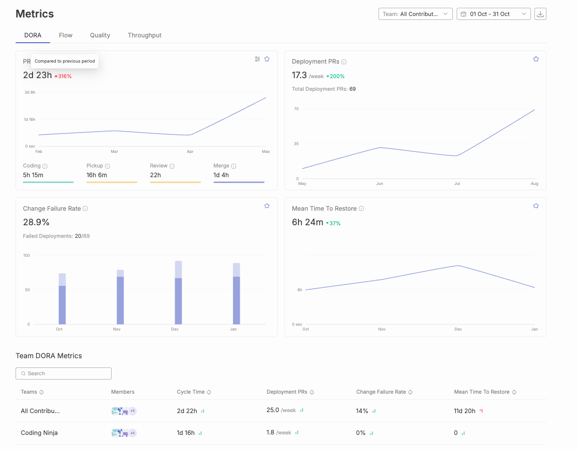
Jellyfish is an advanced analytics platform that aligns engineering efforts with broader business goals. It gives real-time visibility into development workflows and team productivity, focusing on connecting engineering work to business outcomes. Jellyfish helps organizations scale their engineering processes to meet business objectives, supporting automation, security, and governance at the enterprise level. Jellyfish alternatives are often considered for their automated data collection and actionable recommendations.
Key Features:
Pros:
Cons:
G2 Reviews Summary:
G2 reviews highlight strong core features but also point to potential implementation challenges, particularly around configuration and customization.

LinearB is a data-driven DevOps solution designed to improve software delivery efficiency and engineering team coordination. It focuses on data-driven insights, identifying bottlenecks, and optimizing workflows.
Key Features:
Pros:
Cons:
G2 Reviews Summary:
G2 reviews generally praise LinearB’s core features, such as flow management and insightful analytics. However, some users have reported challenges with complexity and the learning curve.

Waydev is an engineering analytics solution with a focus on Agile methodologies. It provides in-depth visibility into development velocity, resource allocation, and delivery efficiency, and enables teams to analyze work patterns to improve productivity and identify bottlenecks.
Key Features:
Pros:
Cons:
G2 Reviews Summary:
G2 reviews for Waydev are limited, making it difficult to draw definitive conclusions about user satisfaction.

Sleuth is a deployment intelligence platform specializing in tracking and improving DORA metrics. It provides detailed insights into deployment frequency and engineering efficiency, offering visibility into technical metrics such as deployment frequency and technical debt. Sleuth specializes in deployment tracking and change management with deep analytics on release quality and change impact.
Key Features:
Pros:
Cons:
G2 Reviews Summary:
G2 reviews for Sleuth are also limited, making it difficult to draw definitive conclusions about user satisfaction

Pluralsight Flow provides a detailed overview of the development process, helping identify friction and bottlenecks. Many engineering leaders use Pluralsight Flow to balance developer autonomy with advanced management insights. It aligns engineering efforts with strategic objectives by tracking DORA metrics, software development KPIs, and investment insights. It integrates with various manual and automated testing tools such as Azure DevOps and GitLab.
Key Features:
Pros:
Cons:
G2 Reviews Summary -
The review numbers show moderate engagement (6-12 mentions for pros, 3-4 for cons), placing it between Waydev’s limited feedback and Jellyfish’s extensive reviews. The feedback suggests strong core functionality but notable usability challenges.Link to Pluralsight Flow’s G2 Reviews

Developer productivity optimization and organizational health analytics comprise the foundational pillars of high-performing engineering ecosystems. For engineering leadership stakeholders, establishing equilibrium between output metrics and team well-being parameters becomes essential for achieving sustainable operational excellence. Comprehensive analytics platforms such as Swarmia and its enterprise alternatives, including Jellyfish and Haystack, are architected to deliver extensive insights into critical performance indicators such as code churn patterns, development velocity metrics, and workflow behavioral analytics. By systematically analyzing these data patterns, leadership teams can quantify productivity benchmarks, identify optimization opportunities, and establish objectives that facilitate both individual contributor advancement and cross-functional team development trajectories. The benefit of using these platforms is improved team performance, greater management visibility, and enhanced developer well-being.
Furthermore, these technological platforms facilitate transparency protocols and seamless communication channels among development team members, enabling enhanced detection of process bottlenecks and proactive challenge resolution mechanisms. Advanced features that monitor workflow patterns and code churn analytics assist leadership in understanding how development methodologies directly impact team health metrics and operational efficiency parameters. By leveraging these comprehensive insights, engineering organizations can implement targeted process enhancement strategies, elevate quality standards, and architect supportive environments where team members can achieve optimal performance outcomes. Ultimately, prioritizing developer productivity optimization and health analytics generates superior deliverable outcomes, enhanced operational efficiency, and establishes more resilient engineering team infrastructures.
Cycle time represents a fundamental metric that directly influences the success of engineering organizations pursuing high-quality software delivery at unprecedented speed. This critical measurement captures the complete duration from the initial moment work commences on a feature or bug fix until its final completion and deployment to end-users, serving as a comprehensive indicator of workflow efficiency across development pipelines. For engineering leaders navigating complex software development landscapes, understanding and systematically optimizing cycle time becomes essential to identify specific areas where development processes can be streamlined, operational bottlenecks can be eliminated, and overall organizational productivity can be significantly enhanced through data-driven decision making.
Modern engineering intelligence platforms such as Jellyfish and LinearB provide comprehensive analytical insights into cycle time performance by systematically breaking down each individual stage of the development process into measurable components. These sophisticated tools enable leaders to measure, analyze, and compare cycle time metrics across different teams, projects, and development phases, making it significantly easier to identify inefficiencies, spot emerging patterns, and implement targeted improvements that address root causes rather than symptoms. Additionally, seamless integrations with established platforms including GitHub and Jira facilitate continuous, real-time tracking of cycle time data, ensuring that performance metrics remain consistently up to date, actionable, and aligned with current development activities across the entire software development lifecycle.
Sleuth further enhances this analytical process by delivering detailed, context-aware recommendations based on comprehensive cycle time analysis, helping development teams identify specific areas requiring immediate attention and improvement. By systematically leveraging these data-driven insights, engineering organizations can make informed strategic decisions that consistently lead to faster delivery cycles, higher software quality standards, and more efficient development workflows that scale with organizational growth. Ultimately, maintaining a focused approach on cycle time optimization and operational efficiency empowers development teams to achieve their strategic development objectives while sustaining a competitive advantage in rapidly evolving software markets.
Engineering management platforms become even more powerful when they integrate with your existing tools. Seamless integration with platforms like Jira, GitHub, CI/CD systems, and Slack offers several benefits:
By leveraging these integrations, software teams can significantly boost productivity and focus on building high-quality products.
Security frameworks and regulatory compliance constitute fundamental architectural pillars for contemporary engineering organizations, particularly those orchestrating sophisticated development workflows that encompass sensitive intellectual property assets and proprietary data ecosystems. Swarmia and its comprehensive ecosystem of leading alternatives—including Typo, LinearB, GitLab, Sleuth, and Code Climate Velocity—acknowledge this critical paradigm by implementing robust security infrastructures and multi-layered compliance architectures that span the entire development lifecycle. These sophisticated platforms typically integrate end-to-end cryptographic protocols, granular role-based access control mechanisms, and systematic security audit frameworks that collectively safeguard mission-critical information assets throughout complex development processes. This involves implementing advanced encryption algorithms that protect data both in transit and at rest, while simultaneously establishing fine-grained permission structures that ensure appropriate access levels across diverse organizational hierarchies and development teams.
For engineering leadership stakeholders, these comprehensive security capabilities deliver strategic confidence and operational assurance, enabling development teams to optimize for velocity metrics and quality benchmarks without introducing security vulnerabilities or compliance gaps into their workflows. Additionally, specialized tools like Sleuth and Code Climate Velocity extend these foundational security measures by incorporating advanced vulnerability scanning engines and real-time compliance monitoring systems that enable organizations to proactively identify, assess, and remediate potential security risks while maintaining adherence to evolving regulatory frameworks and industry standards. These tools analyze code repositories, deployment patterns, and infrastructure configurations to detect potential security exposures before they manifest in production environments. By strategically selecting solutions that demonstrate comprehensive security architectures and compliance capabilities, engineering organizations can effectively protect their valuable intellectual assets, maintain stakeholder trust and regulatory standing, and streamline operational processes while consistently meeting stringent industry standards and regulatory requirements across diverse compliance frameworks.
The implementation of advanced engineering intelligence platforms represents a multifaceted technical undertaking that encompasses significant computational overhead and organizational adaptation requirements, yet the strategic selection of sophisticated analytical frameworks can fundamentally transform development optimization capabilities. Engineering intelligence solutions such as Swarmia, alongside competing platforms including Jellyfish and Haystack, are architected with streamlined initialization protocols and intuitive user experience (UX) patterns designed to accelerate time-to-value metrics for development organizations. These sophisticated platforms typically incorporate comprehensive Application Programming Interface (API) integrations with established development ecosystem tools including GitHub's distributed version control systems and Atlassian's Jira project management infrastructure, thereby enabling engineering leadership to establish seamless data pipeline connectivity while minimizing workflow disruption and maintaining operational continuity across existing development processes.
Furthermore, these advanced engineering analytics platforms provide extensive customization frameworks and comprehensive technical support ecosystems, facilitating organizational adaptation of the platform architecture to accommodate unique development methodologies and operational requirements specific to each engineering organization's technical stack. Through strategic prioritization of implementation efficiency and streamlined onboarding processes, engineering leadership can systematically reduce organizational change resistance, ensure optimal platform adoption trajectories, and enable development teams to concentrate computational resources on core software development activities rather than infrastructure configuration overhead. This optimized implementation methodology enables organizations to sustain development velocity metrics and achieve strategic technical objectives without introducing unnecessary deployment latency or operational bottlenecks.
Engineering teams striving to optimize productivity and revolutionize development workflows require comprehensive, data-driven insights and sophisticated recommendations that facilitate unprecedented operational excellence. Platforms such as Code Climate Velocity deliver transformative analytics capabilities by diving into critical engineering metrics including code churn patterns, velocity trajectories, and development cycle optimization. These sophisticated insights enable engineering managers to systematically identify performance bottlenecks, establish meaningful objectives aligned with organizational goals, and implement benchmarking frameworks that drive exponential efficiency gains and enhanced productivity outcomes.
Through leveraging real-time analytical capabilities and sophisticated dashboard interfaces, advanced tools such as Haystack and Waydev facilitate seamless monitoring of development trajectories while providing automated, intelligent recommendations specifically tailored to each team's unique operational workflows and technical requirements. These comprehensive platforms empower engineering managers to execute data-driven strategic decisions, systematically optimize development processes, and architect workflows that support continuous improvement methodologies and operational excellence. Advanced features comprising customizable metric frameworks and automated workflow intelligence ensure that development teams can rapidly identify performance bottlenecks, streamline complex development pipelines, and systematically achieve their strategic objectives through enhanced operational visibility.
With sophisticated, actionable insights at their disposal, engineering organizations can proactively address complex technical challenges, implement systematic process improvements, and cultivate an organizational culture centered on continuous learning, operational excellence, and enhanced efficiency metrics. This transformative approach not only optimizes team performance across all development phases but also facilitates superior software quality outcomes and accelerated delivery cycle optimization.
Engineering organizations operate within distinct operational paradigms and strategic frameworks, each demanding specialized solutions for development workflow optimization and performance analytics. How do we navigate the comprehensive ecosystem of Swarmia alternatives? The landscape presents a sophisticated array of platforms engineered to address diverse organizational architectures, from agile startup environments requiring rapid iteration capabilities to enterprise-scale operations demanding robust process governance and comprehensive integration frameworks.
For startup environments prioritizing velocity optimization and scalable development workflows, LinearB and Jellyfish emerge as sophisticated solutions engineered for dynamic scaling scenarios. These platforms deliver comprehensive development lifecycle analytics through advanced data aggregation engines, enabling engineering leadership to establish transparent performance baselines and implement data-driven optimization strategies. What makes enterprise-level implementations distinct? Platforms such as GitLab and GitHub provide enterprise-grade collaboration infrastructures with deep integration capabilities, advanced workflow orchestration, and comprehensive process management frameworks specifically architected for complex multi-team development ecosystems requiring sophisticated governance and compliance mechanisms.
Engineering leadership increasingly demands alternatives that prioritize advanced analytics capabilities, team health optimization metrics, and continuous process improvement frameworks. How do modern platforms address these sophisticated requirements? Code Climate Velocity and Haystack differentiate themselves through intelligent dashboard architectures, real-time algorithmic recommendations, and advanced features supporting collaborative working agreements and systematic improvement methodologies. Additionally, specialized platforms like Sleuth and Waydev focus on comprehensive cycle time analytics and workflow optimization engines, leveraging machine learning algorithms to identify performance bottlenecks and implement systematic process streamlining initiatives.
High-performance engineering organizations focused on comprehensive engineering intelligence require sophisticated analytics platforms that deliver actionable insights and strategic recommendations. Platforms such as Pensero and Pluralsight Flow provide advanced analytics engines, comprehensive performance benchmarking capabilities, and algorithmic recommendation systems designed to drive systematic process improvements and achieve strategic organizational objectives. Through systematic evaluation of these sophisticated alternatives using comprehensive assessment frameworks, engineering leadership can implement optimal solutions tailored to their specific operational requirements, ultimately achieving enhanced operational efficiency, comprehensive transparency, and superior software development performance outcomes.
When selecting a Swarmia alternative, keep these factors in mind:
The engineering management tools ecosystem undergoes rapid transformation, presenting sophisticated alternatives to Swarmia that address complex organizational requirements through advanced analytics and machine learning capabilities. How do engineering leaders navigate this evolving landscape? By analyzing historical performance data, deployment patterns, and team velocity metrics, these platforms deliver predictive insights that optimize resource allocation and identify potential bottlenecks before they impact development cycles. Modern alternatives leverage AI-driven algorithms to examine code quality patterns, automated testing coverage, and deployment success rates, enabling organizations to implement data-driven strategies that enhance developer productivity while maintaining robust security protocols and compliance standards.
Looking toward future developments, the market trajectory indicates accelerated innovation in intelligent automation, with emerging solutions integrating natural language processing for requirement analysis, machine learning models for predictive project planning, and AI-enhanced CI/CD pipeline optimization. How will these technological advancements reshape engineering management? By analyzing vast datasets from version control systems, incident response patterns, and team collaboration metrics, next-generation platforms will automatically generate actionable recommendations for workflow optimization and risk mitigation. Engineering organizations that embrace these AI-powered alternatives to Swarmia—featuring automated anomaly detection, intelligent resource scaling, and self-healing infrastructure monitoring—position themselves to achieve sustained competitive advantage through enhanced operational efficiency, reduced time-to-market, and improved software quality metrics in an increasingly complex technological landscape.
Choosing the right engineering analytics platform is a strategic decision. The alternatives discussed offer a range of capabilities, from workflow optimization and performance tracking to AI-powered insights. By carefully evaluating these solutions, engineering leaders can improve team efficiency, reduce bottlenecks, and drive better software development outcomes.

SDLC methodologies provide structured processes for building software, differing in flexibility, delivery pace, and approach to change. This guide is intended for software developers, project managers, and business stakeholders seeking to understand and select the most suitable SDLC methodology for their projects. Choosing the right SDLC methodology is crucial for project success, efficiency, and meeting business goals. SDLC methodologies are structured processes that guide software development and maintenance, helping organizations deliver high-quality software solutions that align with user requirements and business objectives.
The Software Development Life Cycle (SDLC) methodologies provide a structured framework for guiding software development and maintenance. The SDLC process is a cornerstone of project management, helping companies track and control software projects more effectively.
Development teams need to select the right approach for their project based on its needs and requirements. We have curated the top 8 SDLC methodologies that you can consider. Choose the one that best aligns with your project. Over time, SDLC methodologies have evolved significantly since the early days of the Waterfall method, leading to more flexible and adaptive approaches. Let’s get started:
Software Development Lifecycle (SDLC) serves as the foundational architectural framework that underpins any sophisticated software development methodology. It provides a comprehensive, systematized approach enabling development teams to strategically orchestrate planning phases, design specifications, implementation protocols, testing procedures, and deployment strategies for software applications with optimal efficiency and precision. Through adherence to a structured development lifecycle methodology, organizations can effectively optimize resource allocation, establish clear deliverable expectations, and generate high-quality software solutions that align with user requirements and business objectives.
A meticulously architected SDLC empowers development teams to navigate the intricate complexities inherent in software development processes, ensuring that each critical phase—from initial conceptualization through ongoing maintenance and support—undergoes rigorous management and oversight. This systematic approach not only mitigates the risk of costly development errors and technical debt but also streamlines the entire development workflow, facilitating enhanced progress tracking capabilities and adaptive responsiveness to evolving requirements. Ultimately, the software development lifecycle SDLC framework enables development teams to deliver robust, scalable, and secure software applications that meet stringent timeline requirements while maintaining budgetary constraints and operational efficiency. If you're looking for the right tools to streamline your SDLC, check out this guide.
With this foundational understanding, let's explore the most widely used SDLC methodologies in detail.
Before diving into each methodology, here’s a comparative overview of the top SDLC methodologies and their core characteristics:
SDLC methodologies are structured processes that guide software development and maintenance. Each methodology offers a unique approach to flexibility, delivery pace, and handling change, making it essential to choose the one that best fits your project’s needs.
The waterfall methodology is the oldest surviving SDLC methodology that follows a linear, sequential approach. In this approach, the development team completes each phase before moving on to the next, and each phase has its own project plan detailing the tasks and deliverables required. The five phases include Requirements, Design, Implementation, Verification (which includes the testing phase), and Maintenance.
The waterfall methodology requires that once a phase is completed, the team cannot return to the previous phase, making it difficult to address issues that arise later. The testing phase in the waterfall methodology occurs only after the implementation (coding) phase is complete, which can delay the identification of defects. The Waterfall model is best suited for projects with clear, well-defined requirements and a low probability of change. However, it has been criticized for its rigidity and lack of flexibility, leading to lengthy development cycles and making it difficult and expensive to implement changes after the fact. The Waterfall model was first introduced by Winston W. Royce in the 1970s.

However, in today’s world, the waterfall methodology is not ideal for large and complex projects, as it does not allow teams to revisit the previous phase. The Waterfall methodology is often considered outdated, as many organizations have moved towards more flexible methodologies like Agile. That said, the Waterfall Model serves as the foundation for all subsequent SDLC models, which were designed to address its limitations.
This software development approach is known as an iterative methodology, which embraces repetition and incremental progress. In the Iterative model, each iteration cycles through all the phases of the SDLC, allowing for continuous refinement and improvement. The development team uses iterative development, enabling repeated cycles of planning, testing, and refinement based on feedback and changing requirements. This approach builds software piece by piece while identifying additional needs as they go along. Each new phase produces a more refined version of the software.

In this model, only the major requirements are defined from the beginning. One well-known iterative model is the Rational Unified Process (RUP), developed by IBM, which aims to enhance team productivity across various project types. Agile, one of the most popular SDLC methodologies, is also based on iterative development, flexibility, and organization-wide collaboration.
This methodology is similar to the iterative model but differs in its focus. In the incremental model, the product is developed and delivered in small, functional increments through multiple cycles. It prioritizes critical features first and then adapts additional functionalities as requirements evolve throughout the project.

Simply put, the product is not held back until it is fully completed. Instead, it is released in stages, with each increment providing a usable version. This allows for easy incorporation of changes in later increments. However, this approach requires thorough planning and design and may require more resources and effort.
The Agile SDLC methodology is a flexible and iterative approach to software development. Developed in 2001, it combines iterative and incremental models aiming to increase collaboration, gather feedback, and enable rapid product delivery. It is based on the theory “Fail Fast and Early,” which emphasizes quick testing and learning from failures early to minimize risks, save resources, and drive rapid improvement.
Agile teams are collaborative, cross-functional groups that organize their work into sprints or visual workflows, such as Kanban boards, to enhance responsiveness, transparency, and continuous improvement. Agile structures projects into sprints—time-boxed iterations that typically last between 1–4 weeks. This approach emphasizes continuous collaboration between team members and stakeholders, with regular cycles of feedback and iteration. Agile benefits from high customer orientation and strong team collaboration, making it most suitable for ongoing projects that need to adapt to changing market requirements and demands. However, Agile relies on minimal documentation, which can make it less suitable for complex projects. Agile emphasizes collaboration, continuous delivery, and customer feedback.

The software product is divided into small incremental parts that pass through some or all the SDLC phases. Each new version is tested and feedback is gathered from stakeholders throughout their process. This allows for catching issues early before they grow into major ones. A few of its sub-models include Extreme Programming (XP), Rapid Application Development (RAD), and Kanban. Scrum is a popular agile framework—a structured approach within Agile that organizes teams and workflows to enhance project flexibility, collaboration, and efficiency.
A flexible SDLC approach in which the project cycles through four phases: Planning, Risk Analysis, Engineering, and Evaluation, repeatedly in a figurative spiral until completion. This methodology is widely used by leading software companies, as it emphasizes risk analysis, ensuring that each iteration focuses on identifying and mitigating potential risks.

This model also prioritizes customer feedback and incorporates prototypes throughout the development process. It is particularly suitable for large and complex projects with high-risk factors and a need for early user input. However, for smaller projects with minimal risks, this model may not be ideal due to its high cost.
Derived from Lean Manufacturing principles, the Lean Model focuses on maximizing user value by minimizing waste and optimizing processes. It aligns well with the Agile methodology by eliminating multitasking and encouraging teams to prioritize essential tasks in the present moment.

The Lean Model is often associated with the concept of a Minimum Viable Product (MVP), a basic version of the product launched to gather user feedback, understand preferences, and iterate for improvements. Key tools and techniques supporting the Lean model include value stream mapping, Kanban boards, the 5S method, and Kaizen events.
An extension to the waterfall model, the V-model is also known as the verification and validation model. It is categorized by its V-shaped structure that emphasizes a systematic and disciplined approach to software development. In this approach, the verification phase ensures that the product is being built correctly and the validation phase focuses on the correct product is being built. These two phases are linked together by implementation (or coding phase).

This model is best suited for projects with clear and stable requirements and is particularly useful in industries where quality and reliability are critical. However, its inflexibility makes it less suitable for projects with evolving or uncertain requirements.
The DevOps model is a hybrid of Agile and Lean methodologies. It brings together development and operations teams to enhance collaboration and integration throughout the systems development process. DevOps aims to automate processes, integrate CI/CD, and accelerate the delivery of high-quality software.It focuses on small but frequent updates, allowing continuous feedback and process improvements. DevOps promotes a culture of shared responsibility, where all parties work together throughout the entire software development lifecycle. The DevOps methodology aims to shorten the systems development life cycle and provide continuous delivery with high software quality by integrating software development and IT operations. The DevOps movement began around 2008, driven by the need for rapid changes and cross-functional collaboration. This enables teams to learn from failures, iterate on processes, and encourage experimentation and innovation to enhance efficiency and quality.

DevOps is widely adopted in modern software development to support rapid innovation and scalability. However, it may introduce more security risks as it prioritizes speed over security.
To optimize the effectiveness of the software development lifecycle, it becomes imperative to leverage proven methodologies and strategic approaches throughout the comprehensive development trajectory. The following framework comprises essential strategies that facilitate teams in delivering superior software applications that meet organizational objectives and stakeholder expectations:
The foundation of successful software development initiatives comprises establishing a thorough understanding of project scope, objectives, and anticipated deliverables. Well-documented project requirements serve as the cornerstone that ensures all stakeholders involved in the software development process maintain alignment and coordinate efforts toward achieving unified objectives. This comprehensive approach facilitates seamless communication among cross-functional teams and minimizes potential misunderstandings that could compromise project outcomes.
The selection of an appropriate SDLC model constitutes a critical decision that should align with the project's complexity, scale, and specific requirements. Whether organizations opt for the Agile methodology to enhance flexibility and iterative development or choose the Waterfall model for implementing a more traditional and sequential software development approach, the strategic selection will significantly streamline the development lifecycle and optimize resource utilization across project phases.
Proactive identification of potential risks during the initial project phases represents a fundamental practice for maintaining project stability. Through systematic risk analysis implementation, development teams can formulate robust mitigation strategies that address potential issues before they adversely impact the software development lifecycle trajectory, thereby ensuring project continuity and maintaining predetermined timelines and quality standards.
The integration of quality assurance protocols and comprehensive testing procedures into each stage of the SDLC constitutes an essential practice for maintaining software excellence. Regular implementation of unit testing, integration testing, and system testing methodologies facilitates early defect detection and resolution, ensuring that the final software application meets the highest industry standards and organizational quality benchmarks.
Encouraging transparent communication channels and fostering collaborative teamwork among developers, business analysts, project managers, and stakeholders represents a cornerstone of successful software development initiatives. Effective collaboration frameworks ensure that stakeholder feedback is incorporated expeditiously and that the entire development process operates with optimal efficiency, facilitating knowledge transfer and reducing potential bottlenecks.
The automation of build, test, and deployment pipelines through continuous integration and continuous delivery (CI/CD) methodologies significantly enhances operational efficiency and reduces manual intervention requirements. This strategic approach minimizes human errors, accelerates release cycles, and facilitates rapid delivery of software updates to end-users, thereby improving overall system responsiveness and user satisfaction.
Systematic tracking of project progress against established project plans while maintaining readiness for adaptive modifications represents a critical success factor. Regular analysis of performance metrics and user feedback enables development teams to make informed adjustments and strategic decisions, ensuring that the software development lifecycle maintains optimal efficiency and effectiveness throughout the project duration.
Through the implementation of these comprehensive best practices, software development teams can systematically minimize operational risks, enhance quality assurance protocols, and deliver software applications that truly align with customer expectations and organizational objectives while maintaining competitive advantages in the marketplace.
Intelligent engineering management platform - It is used for gaining visibility, removing blockers, and maximizing developer effectiveness throughout the SDLC process. By providing visibility into the entire SDLC process, Typo enables transparency, efficiency, and better decision-making for software organizations. Through SDLC metrics, you can ensure alignment with business goals and prevent developer burnout. This tool can be integrated with the tech stack to deliver real-time insights. Git, Slack, Calendars, and CI/CD to name a few.
Typo Key Features:

Apart from the Software Development Life Cycle (SDLC) methodologies mentioned above, there are alternative methodologies and other software development models you can take note of. Each methodology or model follows a different approach to creating high-quality software, depending on factors such as project goals, complexity, team dynamics, and flexibility. Traditional models like Waterfall are often considered outdated, as many organizations have moved towards more flexible methodologies such as Agile, which have replaced or improved upon older practices.
Be sure to conduct your own research to determine the optimal approach for producing high-quality software that efficiently meets user needs.
The Software Development Life Cycle (SDLC) is a structured process that guides the development and maintenance of software applications.
The main phases of SDLC include:
The purpose of SDLC is to provide a systematic approach to software development by setting clear software development goals at the beginning of the process. This ensures that the final product meets user requirements, stays within budget, and is delivered on time. The SDLC also helps the project team manage risks, improve collaboration and communication, and maintain software quality throughout its lifecycle.
Yes, SDLC can be applied to various software projects, including web applications, mobile apps, enterprise software, and embedded systems. However, the choice of SDLC methodology depends on factors like project complexity, team size, budget, and flexibility needs.

Developer Experience (DevEx) is essential for boosting productivity, collaboration, and overall efficiency in software development. The right DevEx tools streamline workflows, provide actionable insights, and enhance code quality. New tools and new features are continually introduced to address evolving developer needs and improve the developer experience.
Understanding the developer journey is crucial—DevEx tools support developers at every stage, helping to identify and reduce friction points for a smoother experience. Integrating with existing workflows is important to ensure seamless adoption and minimal disruption.
We’ve explored the 10 best Developer Experience tools in 2025, highlighting their key features and limitations to help you choose the best fit for your team. Following best practices is vital to optimize developer experience and productivity. Satisfied developers are more productive and contribute to higher quality software.
These DevEx tools are also essential for streamlining api development, in addition to other software development processes.
Developer Experience (DevEx) constitutes the foundational infrastructure that orchestrates the comprehensive software development ecosystem, fundamentally transforming how development teams architect, implement, and deploy high-quality software solutions. An optimized developer experience framework not only enables developers to concentrate on complex algorithmic challenges and innovative feature development, but also drives exponential productivity gains through intelligent automation, workflow optimization, and friction elimination across the entire development lifecycle infrastructure. DevEx tools are specifically designed to improve the way developers work by reducing friction and streamlining daily tasks, making it easier for teams to focus on delivering value.
When organizations strategically invest in sophisticated DevEx platforms and intelligent toolchains, they empower their development teams to leverage advanced automation capabilities, streamline resource-intensive processes, and optimize existing development workflows through data-driven insights and predictive analytics. This comprehensive approach results in accelerated development cycles, enhanced cross-functional collaboration frameworks, and significantly improved developer satisfaction metrics, enabling teams to allocate substantially more resources toward core coding activities while minimizing operational overhead and routine task management. From seamless environment provisioning and comprehensive API documentation to intelligent integration capabilities with existing development infrastructure, every component of the DevEx ecosystem contributes to a more efficient, scalable, and resilient software development lifecycle. These tools allow developers to design, test, and integrate APIs efficiently, facilitating easier development workflows and collaboration.
Throughout this comprehensive analysis, we’ll examine the critical importance of DevEx optimization, explore the fundamental characteristics that define exceptional developer experience frameworks, and demonstrate how strategically implemented DevEx solutions can enable development teams and organizations to achieve ambitious technical objectives and business outcomes. Whether your focus involves enhancing developer productivity metrics, optimizing your software development processes through intelligent automation, or establishing a more collaborative and efficient environment for your development teams, understanding and systematically optimizing DevEx represents a crucial strategic imperative for modern software organizations.
For engineering leaders, optimizing developer experience (DevEx) comprises a critical architectural decision that directly impacts software development lifecycle (SDLC) efficiency and team performance metrics. A streamlined DevEx enables developers to dive into complex algorithmic challenges and innovative solutions rather than wrestling with inefficient toolchains or fragmented workflows that compromise productivity baselines. By leveraging integrated development environments (IDEs) that offer advanced debugging capabilities, robust version control systems like Git, and automated CI/CD pipeline integration, engineering leaders facilitate development teams in automating repetitive deployment tasks and streamlining code review processes.
These AI-driven development tools not only enhance developer throughput but also foster enhanced code quality standards and sustained team engagement across distributed development environments. Ultimately, when engineering leaders invest in comprehensive DevEx optimization strategies, they empower their development teams to deliver production-ready software with improved velocity, implement data-driven decision-making throughout the entire SDLC, and continuously optimize development workflows through infrastructure as code (IaC) practices for superior project deliverables. Facilitating developers through sophisticated tooling ecosystems and architectural patterns serves as the foundation for building resilient, high-performing development teams and achieving scalable organizational objectives.
The DevEx tool must contain IDE plugins that enhance coding environments with syntax highlighting, code completion, and error detection features. They must also allow integration with external tools directly from the IDE and support multiple programming languages for versatility.
By providing these features, IDE plugins help reduce friction in the development process and enable developers to spend more time writing code.
The tools must promote teamwork through seamless collaboration, such as shared workspaces, real-time editing capabilities, and in-context discussions. These features facilitate better communication among teams and improve project outcomes.
Collaboration features empower developers by increasing their confidence, productivity, and autonomy, while also enabling developers to work more efficiently together and focus on innovation.
The Developer Experience tool could also offer insights into developer performance through qualitative metrics including deployment frequency and planning accuracy. A dx platform provides valuable insights for engineering managers by combining quantitative and qualitative data to optimize developer productivity and workflow. This helps engineering leaders understand the developer experience holistically. Analytics from such platforms help identify areas for process and productivity improvements.
For a smooth workflow, developers need timely feedback for an efficient software process. Hence, ensure that the tools and processes empower teams to exchange feedback such as real-time feedback mechanisms, code quality analysis, or live updates to get the view of changes immediately.
Effective feedback loops can increase developer productivity by enabling faster iteration and improvement.
Evaluate how the tool affects workflow efficiency and developers’ productivity. The right DevEx tools improve productivity and help developers achieve better outcomes. Assess it based on whether it reduces time spent on repetitive tasks or facilitates easier collaboration. Analyzing these factors can help gauge the tool’s potential impact on productivity.
Identifying optimal DevEx tools necessitates a comprehensive evaluation framework that encompasses multiple critical dimensions and strategic considerations. Initially, the solution must facilitate seamless integration capabilities with your organization's existing technological infrastructure and established operational workflows, thereby ensuring that development teams can leverage these tools without disrupting their proven methodological approaches and productivity patterns.
Automation functionalities constitute another fundamental pillar—prioritize solutions that demonstrate the capacity to systematically automate repetitive operational tasks and minimize manual intervention requirements, consequently enabling developers to redirect their cognitive resources toward more innovative and high-impact initiatives. Real-time analytical insights coupled with instantaneous preview capabilities represent invaluable architectural features, as they empower development teams to rapidly identify, diagnose, and remediate issues throughout the development lifecycle, thereby optimizing overall process efficiency and reducing time-to-resolution metrics.
Furthermore, the selected tool should embody a developer-centric design philosophy that prioritizes the comprehensive developer journey experience, providing an enriched and empowering environment that facilitates the production of superior software deliverables. Scalability characteristics, robust security frameworks, and extensive documentation ecosystems also comprise essential evaluation criteria, as these elements ensure the solution can dynamically adapt and grow alongside your organizational expansion, safeguard your intellectual property and sensitive data assets, and accelerate developer onboarding and proficiency acquisition timelines. Through systematic consideration of these multifaceted criteria, organizations can strategically select DevEx tools that genuinely enhance developer productivity and align with overarching software development objectives and business outcomes.
Optimizing developer experience necessitates implementing strategic methodologies that streamline workflows and enhance productivity across development teams. Organizations should prioritize intelligent automation frameworks—deploying sophisticated tools and platforms that systematically eliminate repetitive tasks and minimize manual interventions, enabling developers to allocate resources toward core coding activities and innovative solution architecture.
Comprehensive documentation ecosystems serve as critical infrastructure components, facilitating rapid developer onboarding, efficient troubleshooting protocols, and autonomous issue resolution capabilities. Establishing continuous feedback mechanisms proves essential for organizational optimization; by systematically capturing developer insights regarding software development processes, teams can iteratively refine operational workflows and systematically address performance bottlenecks. Implementing unified development platforms that seamlessly integrate multiple tools and services creates cohesive development environments, substantially reducing context-switching overhead and workflow friction.
Security frameworks must maintain paramount importance, with robust tools and methodologies deployed to safeguard development pipelines and ensure code integrity throughout the software development lifecycle. Through strategic adoption of these optimization practices, organizations can cultivate enhanced developer experiences that drive high-performance software delivery and accelerate business value realization.
Integrating application security throughout the Software Development Life Cycle (SDLC) fundamentally transforms the developer experience (DevEx) and establishes the foundation for building trustworthy, resilient software architectures. Modern DevEx platforms leverage AI-driven security tools that embed comprehensive security analysis throughout every phase of the development workflow, enabling developers to identify, analyze, and remediate vulnerabilities with unprecedented efficiency and accuracy.
Automated testing frameworks and real-time security scanning capabilities serve as essential components of this integrated approach, allowing development teams to detect potential security threats, code vulnerabilities, and compliance violations before they propagate to production environments. Machine learning algorithms provide continuous, real-time insights and intelligent feedback mechanisms that empower developers to make data-driven decisions about code security posture, ensuring that industry best practices and security standards are consistently followed at every stage of the development lifecycle.
By prioritizing application security integration within comprehensive DevEx toolchains, organizations not only establish robust protection for their software assets and sensitive data repositories but also enable development teams to maintain focus on delivering high-quality, scalable software solutions without compromising security requirements or operational efficiency. This proactive, AI-enhanced approach to security integration helps maintain stakeholder trust and regulatory compliance while supporting streamlined, automated development processes that accelerate time-to-market and reduce technical debt.
DevEx tools have become increasingly critical components for optimizing project management workflows within modern software development lifecycles, fundamentally transforming how development teams coordinate, execute, and deliver software projects. By providing a comprehensive integrated platform for project management orchestration, these sophisticated tools enable developers to systematically prioritize development tasks, implement robust progress tracking mechanisms, and facilitate seamless cross-functional collaboration with distributed team members across various stages of the development process.
Real-time analytics and feedback loops generated through these platforms empower project managers to execute data-driven decision-making processes regarding optimal resource allocation strategies, timeline optimization, and budget management protocols, ensuring that software projects maintain adherence to predefined delivery schedules and performance benchmarks.
Intelligent automation of routine administrative tasks and workflow orchestration allows development teams to redirect their focus toward more complex problem-solving activities and creative software architecture design, significantly enhancing overall productivity metrics and reducing operational overhead costs throughout the development lifecycle. Additionally, these AI-enhanced DevEx platforms help project managers systematically identify process bottlenecks, performance optimization opportunities, and workflow inefficiencies, ultimately leading to higher quality software deliverables and superior project outcomes that align with business objectives.
By strategically leveraging DevEx tool ecosystems for comprehensive project management, organizations can enable development teams to operate with enhanced efficiency, achieve strategic development goals, and deliver substantial business value through optimized software delivery processes.
Typo is an advanced engineering management platform that combines engineering intelligence with developer experience optimization to enhance team productivity and well-being. By capturing comprehensive, real-time data on developer workflows, work patterns, and team dynamics, Typo provides engineering leaders with actionable insights to identify blockers, monitor developer health, and improve overall software delivery processes.
Its pulse check-ins and automated alerts help detect early signs of burnout, enabling proactive interventions that foster a positive developer experience. Typo seamlessly integrates with popular tools such as Git, Slack, calendars, and CI/CD pipelines, creating a unified platform that streamlines workflows and reduces manual overhead. By automating routine tasks and providing visibility across the software development lifecycle, Typo empowers developers to focus on high-impact coding and innovation, while engineering managers gain the intelligence needed to optimize team performance and drive efficient, high-quality software development.
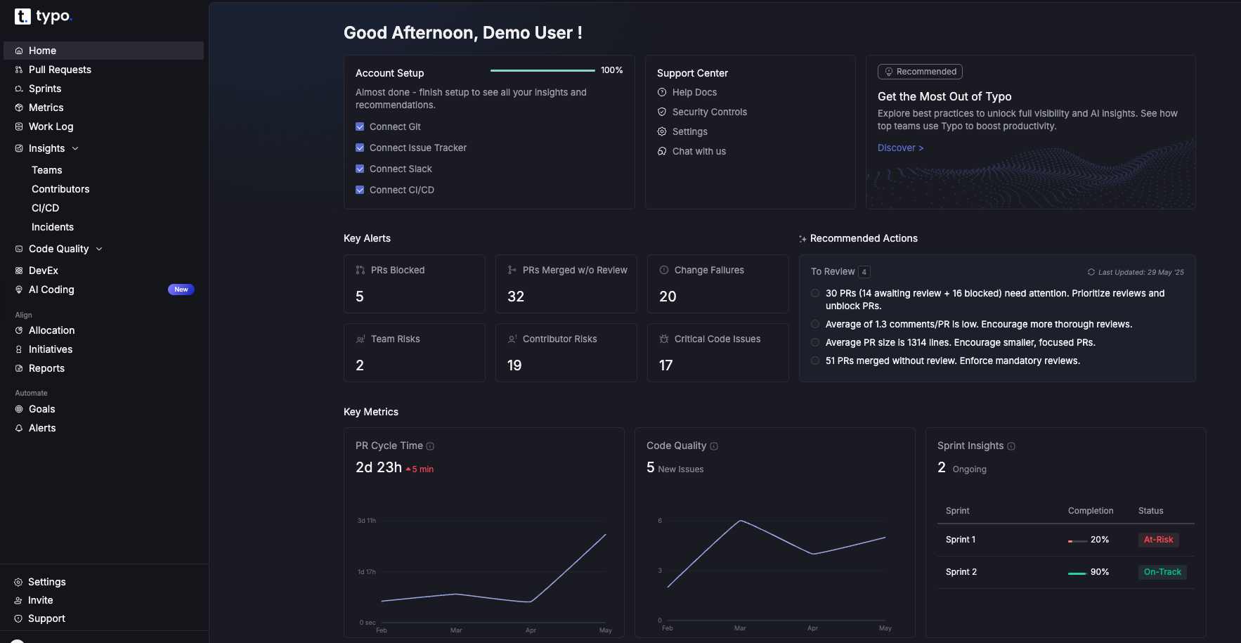
DX is a comprehensive insights platform founded by researchers behind the DORA and SPACE framework. It offers both qualitative and quantitative measures to give a holistic view of the organization. GetDX breaks down results based on personas and streamlines developer onboarding with real-time insights.
By providing actionable insights, GetDX enables data-driven decision-making, allowing developers to focus on building and deploying applications rather than managing complex deployment details.
Jellyfish is a developer experience platform that combines developer-reported insights with system metrics. It also includes features for application security, embedding security testing and vulnerability management into the software development lifecycle. It captures qualitative and quantitative data to provide a complete picture of the development ecosystem and identify bottlenecks. Jellyfish can be seamlessly integrated with survey tools or use sentiment analysis to gather direct feedback from developers. Additionally, Jellyfish is compatible with a wide range of tech stack components, ensuring smooth integration with existing tools and technologies.
LinearB provides engineering teams with data-driven insights and automation capabilities. This software delivery intelligence platform provides teams with full visibility and control over developer experience and productivity. LinearB also helps them focus on the most important aspects of coding to speed up project delivery. For those interested in exploring other options, see our guide to LinearB alternative and LinearB alternatives.
By automating routine tasks and integrating with existing tools, LinearB significantly reduces manual work for engineering teams.

Github Copilot was developed by GitHub in collaboration with open AI. It supports open source projects by helping developers identify, manage, and secure open-source packages, which is essential for preventing vulnerabilities and ensuring compliance. It uses an open AI codex for writing code, test cases and code comments quickly. Github Copilot helps developers by providing AI-powered code suggestions, accelerating programming tasks, and aiding in writing higher-quality code more efficiently. It draws context from the code and suggests whole lines or complete functions that developers can accept, modify, or reject. Github Copilot can generate code in multiple languages including Typescript, Javascript and C++. Copilot is also designed to empower developers by increasing their confidence, productivity, and autonomy in coding.
Postman is a widely used automation testing tool for API. It is also widely used for API development, offering features that simplify designing, building, and collaborating on APIs throughout their lifecycle. It provides a streamlined process for standardizing API testing and monitoring it for usage and trend insights. This tool provides a collaborative environment for designing APIs using specifications like OpenAPI and a robust testing framework for ensuring API functionality and reliability.

Claude Code is an AI-powered coding assistant designed to help developers write, understand, and debug code more efficiently. Leveraging advanced natural language processing, it can interpret developer queries in plain English and generate relevant code snippets, explanations, or suggestions to streamline the software development process.
Claude Code enhances the developer experience by integrating seamlessly into existing workflows, reducing friction, and enabling developers to focus on higher-value tasks.
Cursor is an AI-powered coding assistant designed to enhance developer productivity by providing intelligent code completions, debugging support, and seamless integration with popular IDEs. It helps developers focus on writing high-quality code by automating repetitive tasks and offering instant previews of code changes.
Vercel is a cloud platform that gives frontend developers space to focus on coding and innovation. Vercel is known for enabling high performance in web applications by leveraging optimized deployment processes and a global edge network. It simplifies the entire lifecycle of web applications by automating the entire deployment pipeline. Vercel has collaborative features such as preview environments to help iterate quickly while maintaining high code quality. Vercel also supports serverless functions, allowing developers to deploy code that runs on-demand without managing servers.
A cloud deployment platform to simplify the deployment and management of applications. Quovery simplifies managing infrastructure, making it easier for teams to deploy and scale their applications.
It automates essential tasks such as server setup, scaling, and configuration management that allows developers to prioritize faster time to market instead of handling infrastructure. Quovery automates deployment tasks, allowing developers to focus on building applications.
We've curated the best Developer Experience tools for you in 2025. Feel free to explore other options as well. Make sure to do your own research and choose what fits best for you.
All the best!

Smooth and reliable deployments are key to maintaining user satisfaction and business continuity. Change Failure Rate provides valuable insights into how frequently deployments lead to failures. This guide is for engineering leaders, DevOps teams, and software managers seeking to understand and reduce Change Failure Rate (CFR).
We cover what CFR is, how to calculate it, why it matters, and actionable strategies to improve it. By the end, you’ll have a clear understanding of how to measure, interpret, and reduce CFR for more stable software delivery.
In 2015, Gene Kim, Jez Humble, and Nicole Forsgren founded the DORA (DevOps Research and Assessment) team to evaluate and improve software development practices. The aim is to improve the understanding of how organizations can deliver faster, more reliable, and higher-quality software.
DORA metrics help in assessing software delivery performance based on four key (or accelerate) metrics. A comprehensive overview of DORA metrics can further illustrate how these indicators drive software delivery success:
While these metrics provide valuable insights into a team's performance, understanding CFR is crucial. It measures the effectiveness of software changes and their impact on production environments. Mastering the four key DORA metrics for software delivery performance helps put CFR into proper context.
Change Failure Rate (CFR) measures deployment failures requiring fixes or rollbacks. It is calculated as (Failed Changes / Total Changes) x 100. CFR reflects the stability and reliability of the entire software development and deployment lifecycle, making it one of the most critical DevOps metrics for deployment reliability.
It is important to measure the Change Failure Rate for various reasons. Applying a structured approach to measuring DORA metrics ensures that CFR data is accurate and actionable:
To calculate Change Failure Rate, follow these steps:
Example Calculation:
Using the formula: (2/30) × 100 = 6.67%
Therefore, the Change Failure Rate for that period is 6.67%.
An ideal failure rate is between 0% and 15%. This is the benchmark and standard that engineering teams need to maintain. Low CFR equals stable, reliable, and well-tested software.
When the Change Failure Rate is above 15%, it reflects significant issues with code quality, testing, or deployment processes. This leads to increased system downtime, slower deployment cycles, and a negative impact on user experience.
Hence, it is always advisable to keep CFR as low as possible.

Be sure to define what constitutes a failure for your team to ensure accurate CFR measurement. Also, exclude 'fix-only' deployments from CFR calculations.
Identify the root causes of failures and implement best practices in testing, deployment, and monitoring. Here are effective strategies to minimize CFR:
Since the definition of Failure is specific to teams, there are multiple ways this metric can be configured. Here are some guidelines on what can indicate a failure:
To calculate the final percentage, divide the total number of failures by the total number of deployments (this can be picked either from the Deployment PRs or from the CI/CD tool deployments).

Measuring and reducing the Change Failure Rate is a strategic necessity. It enables engineering teams to deliver stable software, leading to happier customers and a stronger competitive advantage. With tools like Typo, organizations can easily track and address failures to ensure successful software deployments, especially when implementing DORA DevOps metrics in large organizations.

Imagine you are on a solo road trip with a set destination. You constantly check your map and fuel gauge to check whether you are on a track. Now, replace the road trip with an agile project and the map with a burndown chart.
Just like a map guides your journey, a burndown chart provides a clear picture of how much work has been completed and what remains.
Burndown charts are visual representations of the team’s progress used for agile project management. They are useful for scrum teams and agile project managers to assess whether the project is on track. Displaying burndown charts helps keep all team members on the same page regarding project progress and task status.
Burndown charts are generally of three types:
The product burndown chart focuses on the big picture and visualizes the entire project. It determines how many product goals the development team has achieved so far and the remaining work.
Sprint burndown charts focus on the ongoing sprints. A sprint burndown chart is typically used to monitor progress within a single sprint, helping teams stay focused on short-term goals. It indicates progress towards completing the sprint backlog.
This chart focuses on how your team performs against the work in the epic over time. Epic burndown charts are especially useful for tracking progress across multiple sprints, providing a comprehensive view of long-term deliverables. It helps to track the advancement of major deliverables within a project.
When it comes to agile project management, a burndown chart is a fundamental tool, and understanding its key components is crucial. Let’s break down what makes up a burndown chart and why each part is essential.
The horizontal axis, or X-axis, signifies the timeline for project completion. For projects following the scrum methodology, this axis often shows the series of sprints. Alternatively, it might detail the remaining days, allowing teams to track timelines against project milestones.
The vertical axis, known as the Y-axis, measures the effort still needed to reach project completion. This is often quantified using story points, a method that helps estimate the work complexity and the labor involved in finishing user stories or tasks.
The actual work remaining line is the key line on the chart that shows the real-time amount of work left in the project after each sprint or day. This actual work remaining line, sometimes called the actual work line or work line, reflects the actual work remaining at each point in time. It is often depicted as a red line on burndown charts, and the actual work line fluctuates above and below the ideal line as project progress changes. Since every project encounters unexpected obstacles or shifts in scope, this line is usually irregular, contrasting with the straight trajectory of planned efforts.
The ideal work remaining line, also called the ideal effort line, serves as the baseline for planned progress in a burndown chart. The ideal work line depends on the accuracy of initial time or effort estimates—if these estimates are off, the line may need adjustment to better reflect realistic expectations. This line is drawn assuming linear progress, meaning it represents a steady, consistent reduction in remaining work over time. The linear progress shown by this line serves as a benchmark, helping teams compare their actual performance against the expected, ideal trajectory.
Story points are a tool often used to put numbers to the effort needed for completing tasks or larger work units like epics. Story point estimates help quantify the amount of work remaining and are used to track progress on the burndown chart. They are plotted on the Y-axis of the burndown chart, while the X-axis aligns with time, such as the number of ongoing sprints.
A clear sprint goal serves as the specific objective for each sprint and is represented on the burndown chart by a target line. Even though actual progress might not always align with the sprint goal, having it illustrated on the chart helps maintain team focus, motivation, and provides a clear target for assessing whether the team is on track to complete their work within the sprint.
Incorporating these components into your burndown chart not only provides a visual representation of project progress but also serves as a guide for continual team alignment and focus.
A burndown chart shows the amount of work remaining (on the vertical axis) against time (on the horizontal axis). Teams use a burndown chart to track work and monitor progress throughout a project. It includes an ideal work completion line and the actual work progress line. As tasks are completed, the actual line “burns down” toward zero. This allows teams to identify if they are on track to complete their goals within the set timeline and spot deviations early. Burndown charts provide insight into team performance, workflow, and potential issues.
The ideal effort line begins at the farthest point on the burndown chart, representing the total estimated effort at the start of a sprint, and slopes downward to zero by the end. It acts as a benchmark to gauge your team’s progress and ensure your plan stays on course.
This line reflects your team’s real-world progress by showing the remaining effort for tasks at the end of each day. Each day, a new point is added to the actual effort line to accurately represent the team's progress. This process helps visualize the team's progress over time. Comparing it to the ideal line helps determine if you are ahead, on track, or falling behind, which is crucial for timely adjustments.
Significant deviations between the actual and ideal lines can signal issues. These deviations are identified by comparing the actual work remaining to what was originally predicted at the start of the sprint. If the actual line is above the ideal, delays are occurring. Conversely, if below, tasks are being completed ahead of schedule. Early detection of these deviations allows for prompt problem-solving and maintaining project momentum.
Look for trends in the actual effort line. A flat or slow decline might indicate bottlenecks or underestimated tasks, while a steep drop suggests increased productivity. Identifying these patterns can help refine your workflows and enhance team performance. Recognizing these trends also enables teams to find opportunities to improve team productivity.
Some burndown charts include a projection cone, predicting potential completion dates based on current performance. The projection cone can also help assess the team's likelihood of completing all work within the sprint duration. This cone, ranging from best-case to worst-case scenarios, helps assess project uncertainty and informs decisions on resource allocation and risk management.
By mastering these elements, you can effectively interpret burndown charts, ensuring your project management efforts lead to successful outcomes.
Burndown charts are invaluable tools for monitoring progress in project management. Development teams rely on burndown charts to monitor progress and ensure transparency throughout the project lifecycle. They provide a clear visualization of work completed versus the work remaining. By analyzing the chart, teams can gain insights into how the team works and identify areas for improvement.
By adopting these methods, teams can efficiently track their progress, ensuring that they meet their objectives within the desired timeframe. Analyzing the slope of the burndown chart regularly helps in making proactive adjustments as needed.
A burndown chart is a visual tool used by agile teams to track progress. Burndown charts are particularly valuable for tracking progress in agile projects, where flexibility and adaptability are essential. Here is a breakdown of its key functions:
Burndown charts allow agile teams to visualize the remaining work against time which helps to spot issues early from the expected progress. They can identify bottlenecks or obstacles early which enables them to proactive problem-solving before the issue escalates.
The clear graphical representation of work completed versus work remaining makes it easy for teams to see how much they have accomplished and how much is left to do within a sprint. This visualization helps maintain focus and alignment among team members.
The chart enables the team to see their tangible progress which significantly boosts their morale. As they observe the line trending downward, indicating completed tasks, it fosters a sense of achievement and motivates them to continue performing well.
After each sprint, teams can analyze the burndown chart to evaluate their estimation accuracy regarding task completion times. This retrospective analysis helps refine future estimates and improves planning for upcoming sprints.
Additionally, teams can use an efficiency factor to adjust future estimates, allowing them to correct for variability and improve the accuracy of their burndown charts.
Estimating effort for a burndown chart involves determining the amount of work needed to complete a sprint within a specific timeframe. Here’s a step-by-step approach to getting this estimation right:
After the first iteration, teams can recalibrate their estimates based on actual performance, which helps improve the accuracy of future sprint planning.
Start by identifying the total amount of work you expect to accomplish in the sprint. This requires knowing your team's productivity levels and the sprint duration. For instance, if your sprint lasts 5 days and your team can handle 80 hours in total, your baseline is 16 hours per day.
Next, divide the work into manageable chunks. List tasks or activities with their respective estimated hours. This helps in visualizing the workload and setting realistic daily goals.
With your total hours known, distribute these hours across the sprint days. Begin by plotting your starting effort on a graph, like 80 hours on the first day, and then reduce it daily as work progresses.
As the sprint moves forward, track the actual hours spent versus the estimated ones. This allows you to adjust and manage any deviations promptly.
By following these steps, you ensure that your burndown chart accurately reflects your team's workflow and helps in making informed decisions throughout the sprint.
A burndown chart is a vital tool in project management, serving as a visual representation of work remaining versus time. Although it might not capture every aspect of a project’s trajectory, it plays a key role in preventing scope creep.
Burndown charts are especially important for managing scope in a Scrum project, where they help track progress across sprints and epics by visually displaying estimated effort and work completed.
Firstly, a burndown chart provides a clear overview of how much work has been completed and what remains, ensuring that project teams stay focused on the goal. By continuously tracking progress, teams can quickly identify any deviation from the planned trajectory, which is often an early signal of scope creep.
However, a burndown chart doesn’t operate in isolation. It is most effective when used alongside other project management tools:
By consistently monitoring the relationship between time and completed work, project managers can maintain control and make informed decisions quickly. This proactive approach helps teams stay aligned with the project’s original vision, thus minimizing the risk of scope creep.
Both burndown and burnup charts are essential tools for managing projects, especially in agile environments. They provide visual insights into project progress, but they do so in different ways, each offering unique advantages.
A burndown chart focuses on recording how much work remains over time. It’s a straightforward way to monitor project progress by showing the decline of remaining tasks. Burndown charts are particularly effective for tracking progress during short iterations, such as sprints in Agile methodologies. The chart typically features:
This type of chart is particularly useful for spotting bottlenecks, as any deviation from the ideal line can indicate a pace that’s too slow to meet the deadline.
In contrast, a burnup chart highlights the work that has been completed, alongside the total work scope. Burnup charts are designed to show the amount of complete work over time, providing a cumulative view of progress. Its approach includes:
The key advantage of a burnup chart is its ability to display scope changes clearly. This is ideal when accommodating new requirements or adjusting deliverables, as it shows both progress and scope alterations without losing clarity.
While both charts are vital for tracking project dynamics, their perspectives differ. Burndown charts excel at displaying how rapidly teams are clearing tasks, while burnup charts provide a broader view by also accounting for changes in project scope. Using them together offers a comprehensive picture of both time management and scope management within a project.

Open a new sheet in Excel and create a new table that includes 3 columns.
The first column should include the dates of each sprint, the second column have the ideal burndown i.e. ideal rate at which work will be completed and the last column should have the actual burndown i.e. updating them as story points get completed.
Now, fill in the data accordingly. This includes the dates of your sprints and numbers in the Ideal Burndown column indicating the desired number of tasks remaining after each day throughout the let's say, 10-day sprint.
As you complete tasks each day, update the spreadsheet to document the number of tasks you can finish under the ‘Actual Burndown' column.

Now, it's time to convert the data into a graph. To create a chart, follow these steps: Select the three columns > Click ‘Insert' on the menu bar > Select the ‘Line chart' icon, and generate a line graph to visualize the different data points you have in your chart.


Compiling the final dataset for a burndown chart is an essential step in monitoring project progress. This process involves a few key actions that help translate raw data into a clear visual representation of your work schedule.
By compiling your own burndown chart, you can tailor the visualization to your team's unique workflow and project needs.
Start by gathering your initial effort estimates. These estimates outline the anticipated time or resources required for each task. Then, access your actual work logs, which you should have been maintaining consistently. By comparing these figures, you'll be able to assess where your project stands in relation to your original forecasts.
Ensure that your logged work data is kept in a centralized and accessible location. This strategy fosters team collaboration and transparency, allowing team members to view and update logs as necessary. It also makes it easier to pull together data when you're ready to update your burndown chart.
Once your data is compiled, the next step is to plot it on your burndown chart. This graph will visually represent your team’s progress, comparing estimated efforts against actual performance over time. Using project management software can simplify this step significantly, as many tools offer features to automate chart updates, streamlining both creation and maintenance efforts.
By following these steps, you’ll be equipped to create an accurate and insightful burndown chart, providing a clear snapshot of project progress and helping to ensure timelines are met efficiently. Burndown charts can also be used to monitor progress toward a specific release, helping teams align their efforts with key delivery milestones.
A Burndown chart mainly tracks the amount of work remaining, measured in story points or hours. This one-dimensional view does not offer insights into the complexity or nature of the tasks, hence, oversimplifying project progress.
Burndown charts fail to account for quality issues or the accommodation of technical debt. Agile teams might complete tasks on time but compromise on quality. This further leads to long-term challenges that remain invisible in the chart.
The burndown chart does not capture team dynamics or collaboration patterns. It fails to show how team members are working together, which is vital for understanding productivity and identifying areas for improvement.
The problems might go unnoticed related to story estimation and sprint planning. When a team consistently underestimates tasks, the chart may still show a downward trend. This masks deeper issues that need to be addressed.
Another disadvantage of burndown charts is that they do not reflect changes in scope or interruptions that occur during a sprint. If new tasks are added or priorities shift, the chart may give a misleading impression of progress.
The chart does not provide insights into how work is distributed among team members or highlight bottlenecks in the workflow. This lack of detail can hinder efforts to optimize team performance and resource allocation.
Burndown charts are great tools for tracking progress in a sprint. However, they don't provide a full picture of sprint performance as they lack the following dimensions:
For additional insights on measuring and improving Scrum team performance, consider leveraging DORA DevOps Metrics.
Typo’s sprint analysis feature allows engineering leaders to track and analyze their team’s progress throughout a sprint. It uses data from Git and the issue management tool to provide insights into getting insights on how much work has been completed, how much work is still in progress, and how much time is left in the sprint hence, identifying any potential problems early on and taking corrective action.
Scrum masters can use Typo's sprint analysis features to enhance transparency and communication within their teams, supporting agile project management practices.
Sprint analysis in Typo with burndown chart

Burndown charts offer a clear and concise visualization of progress over time. Many agile teams rely on burndown charts to monitor progress and drive continuous improvement. While they excel at tracking remaining work, they are not without limitations, especially when it comes to addressing quality, team dynamics, or changes in scope.
Integrating advanced metrics and tools like Typo, teams can achieve a more holistic view of their sprint performance and ensure continuous improvement.
Sign up now and you’ll be up and running on Typo in just minutes


