Agile project management relies on iterative development cycles to deliver value efficiently. Central to this methodology is the iteration burndown chart, a visual representation of work progress over time. In this blog, we’ll explore leveraging and enhancing the iteration burndown chart to optimize Agile project outcomes and team collaboration. By providing a shared visual reference for progress and goals, iteration burndown charts help keep the team on the same page. Burndown charts are commonly used in agile project management methodologies such as Scrum.
Agile project management is a modern approach that emphasizes adaptability, collaboration, and ongoing enhancement throughout the project lifecycle. Unlike traditional project management methods, Agile breaks down complex projects into smaller, manageable increments, allowing teams to deliver value in short, focused cycles known as sprints. This iterative process not only helps teams respond quickly to changing requirements but also fosters a culture of continuous improvement.
A key aspect of Agile project management is the use of visual tools to track progress and keep everyone aligned. Burndown charts are among the most effective tools for this purpose. By providing a clear, graphical representation of work remaining versus time left in a sprint, burndown charts help teams and stakeholders quickly assess project status, identify potential bottlenecks, and make informed decisions. These charts enable teams to monitor their progress in real time, ensuring that any issues can be addressed promptly and that the project stays on track. Ultimately, integrating burndown charts into Agile project management practices supports transparency, accountability, and the steady delivery of high-quality results.
An iteration burndown chart is a graphical representation of the total work remaining over time in an Agile iteration, helping teams visualize progress toward completing their planned work. Burndown and burnup charts are essential Agile tools for measuring progress within Sprints and communicating ongoing achievements to stakeholders.
A burndown chart, also known as a burn chart, shows the amount of work completed versus the remaining effort throughout the iteration, allowing teams to track daily progress and quickly identify any deviations from the plan. Burndown charts help teams track scope changes and visualize the project timeline, making it easier to identify delays or issues early. At the start of a given sprint, all tasks or backlog items are listed and their estimated effort is determined. This estimated effort is used to plan workload and monitor progress throughout the sprint.

The key components of an iteration burndown chart include axes, effort lines, story points, and the sprint goal. The chart typically features two axes: the x axis (horizontal axis), which represents the iteration timeline (such as days), and the y axis (vertical axis), which represents the remaining effort—often measured in story points. The vertical axis represents the amount of work left to complete in the project or sprint.
The ideal line, also known as the ideal work remaining line, is usually shown as a straight line representing the planned progress from the start to the end of the iteration. This ideal line serves as a benchmark or reference trajectory, helping teams pace their work and compare actual progress to the plan. It typically flattens on non-working days to reflect realistic pacing.
In contrast, the actual line, sometimes displayed as a red line, tracks the actual work remaining throughout the project. The actual line reflects the team's completed work each day and may fluctuate above or below the ideal line depending on the team’s progress. This fluctuation indicates whether the project is ahead, on track, or behind schedule. If a team consistently overestimates time requirements, the burndown chart will show progress as ahead of schedule, while underestimating will show it as behind schedule.
The chart should be based on the team's estimates for each task to ensure accurate forecasting and tracking. Story points are commonly used as the unit of measurement for work remaining on the chart. It's important to note that tracking completed tasks alone can be misleading, especially when task sizes vary. Effort-based metrics like story points provide a more accurate view of progress. The ideal burndown line is based on initial estimates and should be recalibrated after the first iteration to improve accuracy in future sprints.
The chart enables teams to monitor their velocity, identify potential bottlenecks, and make data-driven decisions to ensure successful iteration completion. Teams use the iteration burndown chart to monitor progress throughout the sprint and discuss progress during daily stand-ups, helping to identify blockers and make informed decisions about workload adjustments. The chart helps ensure steady progress toward sprint goals as the sprint progresses by providing a visual representation of work remaining. It also allows teams to compare actual progress against the team’s estimates and the planned pace, so they can make timely adjustments if they fall behind what was originally predicted at the start of the iteration. After the first iteration, teams can recalibrate their estimates and use the chart to project completion dates for future iterations. Teams should review and adjust their plans based on the burndown chart to ensure they meet their sprint goals.
Understanding the advantages of iteration burndown charts is key to appreciating their value in Agile project management. From enhanced visibility to improved decision-making, these charts offer numerous benefits that can positively impact project outcomes. A burndown chart shows how quickly a team is working through a customer’s user stories.
To create a burndown chart, follow these step-by-step instructions to ensure your iteration burndown chart accurately reflects progress and supports efficient project management:
By following these detailed guidelines, you’ll be able to create an accurate and effective iteration burndown chart that can help you and your team monitor your project’s progress and manage it more efficiently.
While creating a burndown chart is a crucial first step, maximizing its effectiveness requires ongoing attention and refinement. These tips will help you harness the full potential of your iteration burndown chart, empowering your development teams to achieve greater success in Agile projects.
Continuous improvement lies at the heart of Agile methodology, and your iteration burndown chart is no exception. By incorporating feedback, analyzing historical data, and experimenting with different approaches, you can refine your chart to better meet your team’s and stakeholders’ needs.
A burndown chart is great for evaluating the ratio of work remaining and the time it takes to complete the work. However, while burndown charts track remaining work, they may not provide detailed insights into the completed work or the types of tasks finished during the iteration. Additionally, burndown charts provide a straightforward view of tasks getting completed but do not reveal much about the quality of that work. Burndown charts do not measure developer productivity, as they only visualize remaining work without considering quality or effectiveness.
Although creating a burndown chart in Excel is easy, entering data manually requires more time and effort. This makes the work repetitive and tiresome after a certain point. Excel and Google Sheets are widely used for basic burndown visualization, allowing users to create a line chart with days on the x-axis and remaining effort on the y-axis.
The Burndown chart helps to track the progress of completing tasks or user stories over time within a sprint or iteration. But, it doesn't provide insights about the specific types of issues or tasks being worked on. It includes shipping new features, determining technical debt, and so on.
A burndown chart doesn’t differentiate between an easy and difficult task. It considers all of them equal, regardless of their size, complexity, or effort required to complete it. Task complexity can significantly affect the interpretation of burndown chart data and may mislead stakeholders about the team's actual performance and capacity. Hence, leading to ineffective outlines of project progress. This further potentially masks critical issues and hinders project management efforts. Using burndown charts as a performance scorecard can lead to negative behaviors, such as inflating estimates or rushing work. Burndown charts should not be used as performance scorecards for individual developers, as this can lead to gaming the system and misrepresenting progress.
The burndown chart primarily focuses on tracking remaining work throughout a sprint, but it doesn't directly indicate the predictability of completing that work within the sprint timeframe. It lacks insight into factors like team velocity fluctuations or scope changes, which are crucial for assessing sprint predictability accurately. Burndown charts are not suitable for projects with fluid requirements, as they do not handle scope changes well.
Burnup charts represent a sophisticated and transformative approach for agile project managers and development teams, offering an unprecedented alternative to conventional burndown methodologies while delivering comprehensive insights into project trajectory and accomplishment metrics throughout the entire development lifecycle. Unlike traditional burndown charts, which inherently limit their focus to the singular dimension of remaining work capacity, burnup charts simultaneously visualize both the total scope of deliverables and the cumulative volume of completed work over temporal progressions. This dual-axis visualization methodology provides stakeholders with an exceptionally comprehensive and nuanced understanding of project advancement, enabling teams to accurately assess their proximity to achieving established objectives while maintaining complete visibility into both accomplished milestones and outstanding deliverables.
Within the complex landscape of agile project management methodologies, burnup charts demonstrate particular excellence in illuminating and quantifying the substantial impact of scope modifications and requirement changes on overall project dynamics. When additional user stories, feature requests, or task specifications are incorporated into the project backlog, the total scope trajectory line within the burnup chart will experience corresponding elevation, creating immediate visual representation of how these evolutionary changes influence the comprehensive timeline and resource allocation strategies. Simultaneously, the completed work progression line continues to demonstrate the team's actual productivity and delivery velocity, facilitating precise comparative analysis between accomplished deliverables and remaining work obligations, thereby enabling data-driven decision-making processes and strategic project adjustments based on empirical performance metrics.
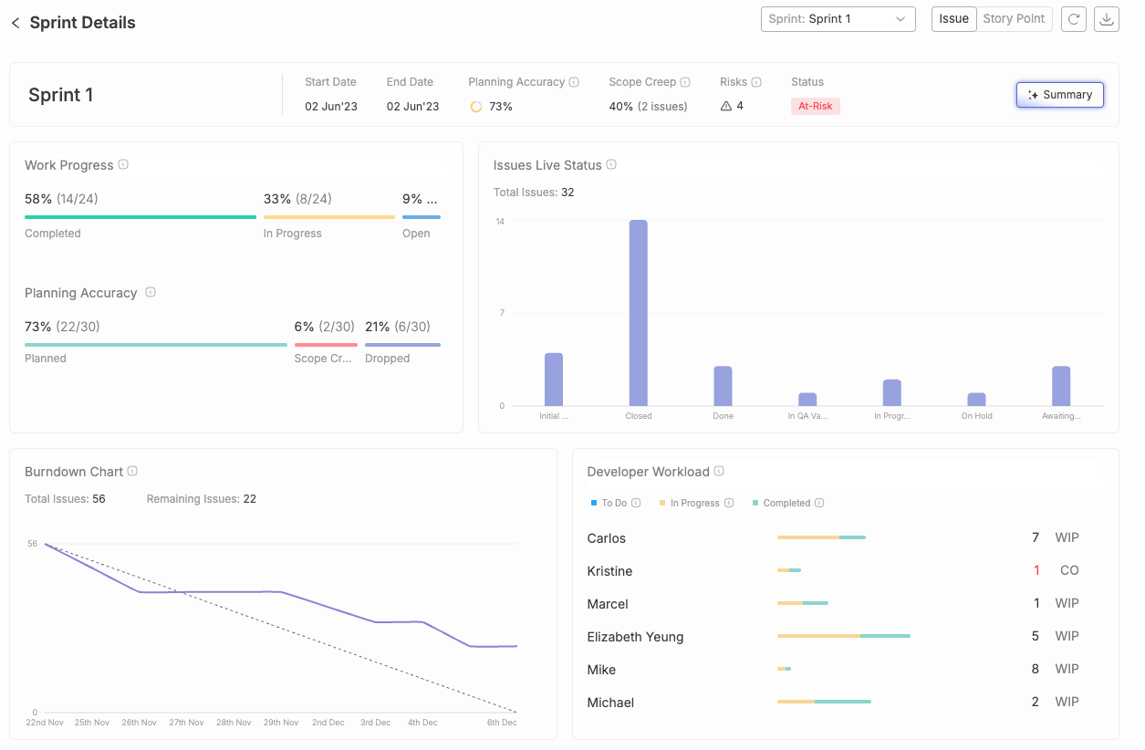
Typo's sprint analysis is an essential tool for any team using an agile development methodology. It allows agile teams to track and analyze overall progress throughout a sprint timeline. It helps to gain visual insights into how much work has been completed, how much work is still in progress, and how much time is left in the sprint. This information can help to identify any potential problems early on and take corrective action.
Our sprint analysis feature uses data from Git and issue management tools to provide insights into how software development teams are working. They can see how long tasks are taking, how often they're being blocked, and where bottlenecks are occurring.
It is easy to use and can be integrated with existing Git and Jira/Linear/Clickup workflows.
The iteration burndown chart is a vital tool in Agile project management. It offers agile and scrum teams a clear, concise way to track progress and make data-driven decisions.
However, one shouldn't rely solely on the burndown charts. Moreover, there are various advanced sprint analysis tools such as Typo in the market that allow teams to track and gain visual insights into the overall progress of the work. Burndown charts are most effective for short-term sprints with fixed scope, where requirements are unlikely to change. ProjectManager is an online software that offers multiple project views to help you collect and track your burndown chart. Jira remains the standard for agile project tracking, with sprint and release burndown charts that update in real time as issues move through the workflow.


Implement engineering metrics, gather SDLC insights & set continuous improvement goals in your dev teams.
Try Live Demo
We're on a mission to build engaged, productive tech teams. Try it out for free!


Follow us on: